MosseryCo Paper Goods

MosseryCo Pocket Notebook

Whimsical illustrations on the covers of the MosseryCo pocket notebooks are what caught my eye when I wandered into their Etsy shop. These 3.5×5.5″ rounded corners pocket notebooks feature 52 pages of acid-free 120 gsm paper. A set of 9 different, illustrated pocket notebooks can be purchased for $36 or individual notebooks can be bought for $6 each. Plain paper covers are also available, individually or in a set.

MosseryCo Pocket Noteboos

What really caught my eye was the hardcover, refillable notepads. The covers looks like vintage books with the quaint illustrations ($20 each) and refill paper can be purchased as needed in different designs ($7 each). The notepads are about 4.25″x6.5″ and are also filled with 110 gsm acid-free paper. There are 110 sheets in each pad and the pads are perforated for easy removal.

MosseryCo Notepads

MosseryCo Notepads

(via MosseryCo’s Etsy Shop)

Ask The Desk: Long-lasting, Archival Notebook

Ask The Desk Header


Brody recently emailed me this question:

Since I got back into pens, I have become really enamored with Fountain Pens. I have been burning through notebooks trying to find good fits for FPs. I also started journalling – one for my daughter, one for my son, and one for me. I started off with the Piccadilly leather-something… and now I realize that if I keep going with this journalling, when I start vol. 2 I might not find a good match. Piccadilly seems to be erratic and in odd supplies. Are they going down for the count?

Anyway – I want to find a good journal that is solid and will last a long time, as well as something archival AND in a format that is likely to be around over the years as I fill them up. Knowing that nothing forever, what’s a good bet? Although I don’t use Leuchtturm 1917, I thought maybe it would work well… many colors and solid paper. Other thoughts?


Piccadilly does cater to the budget market like overstock shops so it can be hit-or-miss to find their on a regular basis. Their web site lists retailers who stock their products. Some people have mentioned issues with the binding over time with Piccadilly so I wouldn’t rely on it for archival journals and keepsakes. I use a Piccadilly for work notes which are not relevant by the end of the week so I don’t plan to pass mine down to future generations.

If you are actually looking for multi-color pages, The Ciak Multicolor Journal might be to your taste.

fabriano-classic-blue-large-artists-journal-6.25-x-8.25-pfa503lg-2

Fabriano used to make one too, for years, but I can’t seem to find anyone selling them now which is sad. They do make a version with an array of white, cream and kraft colored paper but not the rainbow of colors they used to make.

Fabriano has made paper for centuries I think so they would be a good bet though I have not used the paper with fountain pens but it is designed for artists using pencil and pen so it might work well. You may be able to find some Fabriano sketchbooks in a local art supply store.

Rhodia Webnotebooks might be a good option. Excellent paper for fountain pens, well-constructed hardbound books and Clairefontaine has been around for awhile and people love the Webnotebook line so they should be available for years to come. There aren’t a ton of cover colors, black and orange at present but their smaller Rhodiarama line have many different colored covers.

Leuchtturm 1917 neon covers

I think the Leuchtturm1917 should be around for awhile, its good quality and reasonably priced. Its not super high end paper so some wider nibbed pens might bleed but it has the potential to be a book you’ll be able to find for years to come. They come is several sizes and configurations and have lots of cover color options, including a up-to-the-moment neon option at present.

The classic black, artists sketchbooks from Stillman & Birn, Canson or Cachet might also fit your needs since they are all similar sizes and designed for artists so the paper quality is good (usually 65lb or higher) and reasonable priced (between $10-$15 for a 8.5×11″ size). They are available in an A5 and a US Letter size no matter which brand you choose. Some offer a square or spiral bound option as well. And, to butcher a Henry Ford quote,  you can have colored cover you want, as long as you want black. Any art supply store will carry one of these brands (or something comparable) so you’d always have access. I’d recommend the Stillman & Birn to start — the Alpha series paper is not too thick and excellent with fountain pens — though its not as widely available as the other more widely distributed brands.

Cachet Classic Black Sketchbook

Most modern notebooks should have fairly low acidity paper, even if its not labelled “archival.” The artist-grade sketchbooks are definitely archival. I would recommend storing completed journals and notebooks in a dark, dry location (like an opaque plastic tub in  a closet or attic) after its completed to protect it from light degradation or moisture which will could be a bigger threat than the archival-ness  of the paper.

Video: Make Your Own Midori-style Traveler’s Notebook

Make your own Midori-style Traveler’s Notebook in any size (traditional Midori sizes or a leather cover perfectly sized for your Field Notes-sized books) with this great video tutorial:

After you’ve made your own Midori-style TRaveler’s Notebook, don’t forget to check out my previous post about customizing your notebook.

(Thanks to @mattwillgo for the tip)

Out Of Pages Notebook Subscription Service

Out of Pages Notebook Subscription Service

Out of Pages is a subscription service that will send you a new notebook on a specified schedule — every month, or every 2,3,4, or six months or once a year. They break up the costs for the more frequent delivery to an initial fee plus a monthly charge spreading out the costs of the notebooks throughout the year.

They have a limited selection of notebooks: just Moleskines and Field Notes at present but if either of these are your notebook of choice, then this is a great way to keep a fresh one coming as you need it.

You can get a fresh kraft paper Field Notes sent to you every month for $4.20/month. Or a large (5″x8″) Moleskine hardcover can be delivered quarterly for $12.80 up front and $5.60/month. Or get a combination of notebooks on differing schedules.

I love the idea of subscription delivery of items you use regularly, be it socks or notebooks so I think there’s a lot of appeal to this. I hope Out Of Pages will add some other notebook options like Rhodia Webbies or Doane pocket notebooks for a greater variety or options in the near future.

Would you subscribe to a service like this?

Field Notes: Arts & Sciences Colors Edition

Field Notes Arts & Sciences Edition

Today Field Notes announced the newest edition of the Field Notes Colors series: Arts and Sciences. The books are most notable because its a set of two different notebooks– one for arts, one for sciences– and because these books are larger than your average Field Notes at 7.5″ x 4.75″. Isn’t that awesome?

Field Notes Arts & Sciences Edition Size Comparison

Both notebooks have Mohawk Loop 110lb covers printed with  silver ink. Inside are 64 pages of Finch Opaque 50lb paper, the same stocks used in many earlier editions of the Field Notes. The Arts edition has a brick red cover and features “Academy Gray” lined paper on the right hand side and blank sheets on the left for a combination of drawing and writing. The Sciences edition has a dark grey cover and engineering-style grid on the right hand side and blank on the left hand page in the same “Academy Gray”.

Field Notes Arts & Sciences Edition Paper Stocks

On the back covers are seals for the two houses of thought: arts and sciences in the same silver as the cover logos.

Field Notes Arts & Sciences Edition seal

Pack of two (one of each) is available for $9.95 or subscribe to the quarterly Color Subscription for one year for $97. Remember, the Colors editions sell out fast.

Stillman & Birn Paper Sampler

Sillman & Birn sketchbook paper sampler

At the Spectrum Live Art Event I was lucky enough to pick up a couple packets of paper samples from Stillman & Birn. I’ve always been a little flummoxed by their notebook naming system so actually getting a little 4×6″ bit of each paper available was such an eye-opener.

There are six different kinds of paper; three types of paper at the 100 lb/150 gsm weight (Alpha, Gamma and Epsilon) and three types at the 180 lb/270 gsm weight (Beta, Delta, and Zeta).

For the most part, the lighter 100 lb/150 gsm is plenty heavy enough for most writers. If you are planning to do more mixed media, collage or art journaling, you might want to consider the 180 lb/270 gsm papers. To me, these feel more like cardstock than paper.

Sillman & Birn sketchbook paper sampler

I used the same tools on all six papers from an assortment of pens to a brush loaded with ink and a Sharpie marker. All the papers performed admirably and I don’t think anyone would be disappointed by any of them. Even my flexible nib dip pen did not bleed, though on some of the papers it took several minutes to dry (not uncommon for dip pens though).

Stillman & Birn paper grades

The Delta (180 lb/270 gsm) and the Gamma (100lb/150 gsm) are both warm ivory stocks. The Alpha and Beta papers are both cold-press (which means they have some texture to the paper like watercolor papers). Because the Alpha is a lighter stock the tooth to the paper is less noticeable. The smoothest papers are the Epsilon (100lb/150 gsm) and the Zeta (180lb/270 gsm).

Sillman & Birn sketchbook paper sampler

The lighter weight papers were my favorites. I could see using them to write or draw and were thick enough to handle a little water color or ink washes. They would be more than enough for me under most circumstances. The Alpha sample got a lot of ink pooled on it and buckled a little bit as did the Epsilon. The cream ivory Gamma paper stayed flat. The Alpha and the Epsilon were my favorites. The Epsilon is smoother so my tools had very little resistance. The Alpha paper is a little toothier, providing a bit of friction which is helpful with rollerballs and slick gel inks. The Epsilon is probably the most comparable to Canson and other makers of the classic black sketchbook though the paper is a bit heavier weight (better).

Sillman & Birn sketchbook paper sampler

The heavier 180 lb270 gsm papers withstood all the inks and the Sharpie marker without being worse for the wear . The Zeta is smooth to the touch, the Beta has a little tooth to it and the Delta is the creamy ivory with some texture as well.

Sillman & Birn sketchbook paper sampler

From the reverse of the papers, you can see the top row is all the 180 lb/270 gsm papers and the bottom row is the 100 lb/150 gsm papers. There is the merest hint of the Sharpie marker but no actual bleed through.

All-in-all, these are excellent papers and I can see what all the fuss is about now. The best source for Stillman & Birn sketchbooks is Goulet Pens. They stock all six paper stocks in the 5.5×8.5″ A5 size and a few of the other available sizes of the Zeta (smooth, 180 lb/270 gsm). Prices start at $18, about the same as a Moleskine and the S&B books are considerably better for fountain pens.

GIVEAWAY: Oh, I have ONE sampler pack to give away. Its just a little thing with one sheet of all 6 grades of paper. Tell me which grade of paper you’re most interested in trying in the comments to be entered to win.

UPDATE: The kind folks at Stillman & Birn have offered to provide the winner of this giveaway with the notebook of their choice and I’ll still send you the sampler pack as well so now there is even more reason to enter!

FINE PRINT: All entries must be submitted by 10pm CST on Friday, June 13, 2014. All entries must be submitted at wellappointeddesk.com, not Twitter, Tumblr or Facebook, okay? Winner will be announced on Sunday. Winner will be selected by random number generator from entries that played by the rules (see above). Please include your email address in the comment form so that I can contact you if you win. I will not save email addresses or sell them to anyone — pinky swear. If winner does not respond within 30 days, I will draw a new giveaway winner. Shipping via USPS first class is covered. Additional shipping options or insurance will have to be paid by the winner. We are generous but we’re not made of money. I’m feeling generous today so, this contest is open to any reader, US and international readers!

Kickstarter: SketchyNotebook


Sketchy Notebook Kicktarter project


If you liked my post form yesterday of the template guides sheets, you’ll really like the SketchyNotebook Kickstarter project which is an A5 notebook that specifically focuses on providing an assortment of high-visibility page templates for more than just lined paper. There are templates for grid, film/animation storyboarding, 3D perspectives, and more — all printed on water-resistant vinyl stock for durability.

Sketchynotebook templates

One notebook plus your choice of three templates starts at $30 and there is about two weeks left in the campaign.

Sketchynotebook drawing sample

Hop over, check it out. Let me know what you think and if you’ll be funding this project.

(Shout out to My Pencil Draws Worlds for the tip)

Review: Rite in the Rain All-Weather Notebook & 3×5 Notecards

Rite in the Rain All-Weather Notebook and 3x5 notecards

Reader RJ recently retired from the Marines and sent me some spare Rite In The Rain products to review. RJ sent me a standard All-Weather Field Book in sand, a package of 3×5 Index cards and some pens that are recommended for use with the Rite In The Rain paper.

What I learned from my experience with the Rite In The Rain materials is that, if weathering the outdoors, this paper is the bomb. It is limited in the type of writing equipment that will work with the paper though. That said, when outdoor endurance is a factor, the tools that do work with the Rite In The Rain paper work great. I compare it to hiking gear. A good pair of boots, the right wicking fabrics and cushioned, wool socks are all important but may not be the same outfit you’d wear to your sister’s graduation. Rite In The Rain notebooks and notecards are not what you need if you work in an office park. But if you go spelunking on the weekend or need a place for game notes for your rugby team, you might want to consider Rite in the Rain a viable option. If its good enough for a Marine, its good enough for your weekend camping trip.

Rite in the Rain All-Weather notebook cover

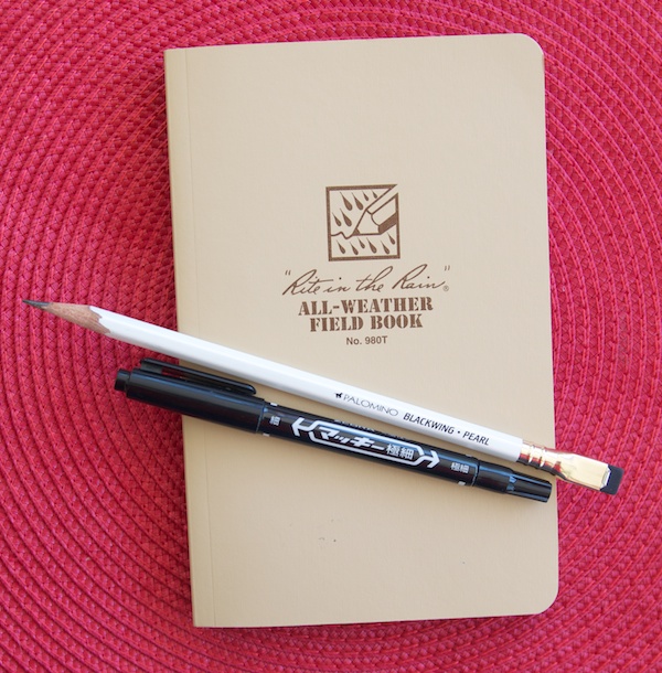
The notebook itself is a clean simple design with a soft cover tan cover printed with brown ink branding. Simple and a little bit “retro cool”.

Rite in the Rain extra pages

In the back are all sorts of tactical keys for notetaking. I was fascinated by all the various symbols and diagrams and envisioned how I might utilize them for my own short hand. Could designing greeting cards benefit from being mapped out with range card prep graphics? Probably not.

Rite in the Rain tear test

The paper itself is tan to match the cover with brown solid lines running horizontally and finer dotted lines running vertically to create a combination lined-and-gridded paper. Because of its water resistant properties I wanted to test if the paper could be torn (as shown above). It can tear fairly easily with your fingers so its not indestructible but it will resist water and live to tell about it.

Rite in the Rain Notebook

At the bottom of each page is  a scale indicator “1 square = ________” which I found charming but probably not useful for most folks, most of the time. Also, I discovered that after I had opened and closed the book a few times, it did not close flat. The book does not include a ribbon bookmark or elsatic. The binding is pretty tight which will probably make it more durable but I’d definitely recommend a belt or elastic of some kind or smash it between stuff in your backpack.

There are no added pockets or accoutrements in this notebook. If any notebook had a right to be all business and no frills, Rite in the Rain would be it.

Rite in the Rain Recommended Tools

But let’s get down to the tools and how they perform on the paper. When I started testing the papers, I used a bunch of tools trying to see how many worked. In the end, I decided to show you what did work. If you want to invest in this sort of field book, use the right tools for the job. And a fountain pen, no matter what ink you choose, is NOT the right tool.

So here goes:

Rite in the Rain recommended markers

Markers with an alcohol base work great on the Rite in the Rain paper. Basically any plastic-tipped or felt-tipped pen advertised as permanent or waterproof should work. Sharpie markers, Zebra Mackee Double Sided Name Markers, Staedtler Lumocolor Permanent, Marvy LePen Technical Drawing Pens  and even the Pilot Envelope Pen (though its a rollerball, it seems to work okay once it gets going).

Rite in the Rain recommended pencils

Pencils are aces on the Rite in the Rain paper. I tested both wood-cased and mechanical pencils and they booth work fine. Softer leads like HB  and softer worked better than 2H pencils and harder. Partly because the paper is not a crsip bright white but a soft tan so softer leads show up darker and more legibly.

Rite in the Rain recommended ballpoints

My least favorite writing tool is the ballpoint but, for Rite in the Rain, they work well. If you’ve got a drawer full of neglected dime store ballpoints, Rite in the Rain paper will welcome them and withstand the elements.

I forgot to mention that the 3×5 notecards use the same heavy weight paper in the notebook (or just a tiny bit heavier). The notecards are only printed on one side, the backs are blank which I think made them extra useful.

Rite in the Rain reverse side

But the big “ah ha!” was that there was no bleeding, feathering or show through when the recommended tools are used on the Rite in the Rain paper. That’s right. If you love Sharpies, this paper is for you. The ink sits up on the paper and does not blur or feather like Sharpie markers normally do on most paper. The same could be said for all those wide, inky behemoths like the Copic Ciao brush pen. No bleeding. No show through.

Rite in the Rain, in water

And finally, what you’ve all been waiting for… how water resistant? THIS water resistant. I drop the two notecards I used in the earlier photo into a bowl of water. Plopped them in and fully submerged them. I even let them soak for awhile until they got limp. Then I pulled them out of the water wiped them with my hands and set them on the ledge on the patio to dry.

Rite in the Rain, dry

You can see the water droplets still clinging in some places but not a bit of the ink or pencil budged.

In the end, the notebook is probably a bit too rugged for most of my needs. My idea of outdoorsy is going to a yard sale but I really like the 3×5 notecards. I think keeping a stack of these in my glove box along with an all-weather writing tool like the Rite in the Rain ballpoint. It is a perfect emergency note kit. No cup holder coffee spills will mar my next grocery list!

Final note: The Rite in the Rain products definitely got me thinking about the advantages of all-weather paper and notebooks. Despite their pen-variety limitations, in the right circumstance, its more important to capture those notes, ideas or tactical maneuvers than it is to use your favorite fountain pen. It makes me want to go back and try the Expedition Edition Field Notes again with this in mind.

(Thanks to RJ for his kindness in sharing these products with me. Its readers like you that keep this blog going and I appreciate it immensely)

Link Love: Four P’s and some I’s

Link Love Link Mascot

Inks:

Pens:

Paper & Notebooks:

Pencils:

Penmanship:

Field Notes: Shelterwood Edition

Field Notes Shelterwood

Finally! Its the new Colors Edition of Field Notes called Shelterwood. I’m sure you’ve already heard about it already and probably already opened your order, but in case you haven’t… admire it here.

These memo books are covered with a veneer of real wood, laminated to kraft paper. Inside is the same 70lb Finch text weight stock that Coudal has previously used in the “America The Beautiful” edition, this time with lines in “Maidenhair Green”. The staples are gold toned and the logo is silkscreened on the covers in white.

Field Notes Shelterwood

Other people have mentioned it but once the shrink wrap is removed, the books don’t close completely. The covers still feel fairly flexible though I probably wouldn’t risk folding the cover all the way back on itself for fear of cracking the spine.

Since I carry my Field Notes in a leather cover, the not-quite-closed covers don’t bother me at all. If you’re inclined to carry them in a shirt pocket, this might be a little annoying.

Field Notes Shelterwood

Opening the package, the books smell so good. It was like the books were imbued with fresh pencil shavings.

Field Notes Shelterwood

You’ll notice the book in the middle has faint “tan lines”. I had the books in the shrinkwrap with the belly band on, laying on my desk for about a week. For whatever reason, that caused the uncovered parts to darken slightly. If you are hoping to keep your Shelterwoods MINT, keep them out of the light.

Field Notes Shelterwood

Since the paper is similar to America The Beautiful, I didn’t do an extensive writing test. I know that some, but not all fountain pens, pencils, gel and ballpoints work great and markers like Sharpies will bleed terribly. So this time, I just lined them up and gave them a quick test. Results were consistent with the America The Beautiful.

If you love Field Notes, you’ll want to grab this limited edition while you can. If this is your first foray into Field Notes, be aware this is very different product from the regular editions. Enjoy it, collect it but just know this is something a little different.

A Knitter’s Notebook

notebook_pic

All specialty skills have their own languages, knitting is no exception. In fact, it has its own codes to convey patterns and notes in a way that might baffle non-knitters. The new True Brit Knits knitter’s notebook provides a great place for knitters to track projects and pattern notes complete with standard pattern abbreviations and symbols on the inside front cover and a ruler in centimeters on the inside back cover, perfect for measuring your swatches. The kraft paper covers feature red, foil stamped knitting needles too.

It’s compact, A5 size is filled with 28 sheets (56 pages) of 100gms paper with clean white paper, alternating plain sides and 4:3 ratio graph paper printed in a pale blue.  £10.00

(via My Life in Knitwear, shoutout to Laura at The Corner of Knit and Tea for the tip)

Link Love: Official Mascot and more catch-up

Link Love Link MascotFirst, I’d like you to all admire my new and fully customized Link mascot thanks to my pal and co-worker Adan who, clearly, is a fabulous illustrator. I think I need Link on a t-shirt!

Now, on to the links:

Paper:

Pens:

Inks:

Pencils:

Misc:


Review: Etranger di Costarica Memo Book

Etranger di Costarica Memo Book

The Etranger di Costarica memo book is a simple, little, pocket-sized notebook. The appealing thing for me was ,of course, the transparent plastic cover in a gorgeous lime green. I was really hoping that the cover would be the right size to fit over a standard Field Notes. Sadly, the Etranger di Costarica memo book is a tiny bit smaller than a Field Notes (or other pocket notebook) measuring at 3.3 x 5.4″.

The cover is printed with a little mail carrier icon and the words “mettre le courrier à la poste le courrier est arrivé”, which roughly translates to “put the mail in the post, the mail has arrived”. How can I not like a postally-themed memo book?

The book itself is a white gloss-coated cardstock cover, inside a transparent flexible plastic cover adding a little durability. The book has black paper end papers and a stitched binding (not staples, actual stitching). Inside the paper is white with grey lines and red margin lines, top and bottom. The lines are spaced at a snug 5mm, good for people like me who tend to write smaller than most. The book has rounded corners which I always think make a book look “finished”.

Etranger di Costarica Memo Book

In writing tests, I was pleased with the paper quality. There was no feathering or bleeding though my line widths looked a bit wider on this paper than in other instances. Ah, the strange and wonderful mysteries of paper!

Etranger di Costarica Memo Book

Despite a bit more absorption on the front of the paper, thus creating a but wider line, from the back there was no noticeable show through or bleed. I did not challenge it with a Sharpie marker as we can all assume it will bleed through as it does on any paper that is not corrugated cardboard.

At $3.30 per book, its only slightly more expensive than the standard pocket memo book and since is has a plastic cover, I assume that’s the additional cost. There are eight other cover colors plus clear and refills can be purchased for $1.65 each. Excellent value!

I like the size, the simplicity and the lines. While this won’t replace my Field Notes in the long run, its a nice addition to my notebook arsenal.


DISCLAIMER: This item was sent to me free of charge by Jet Pens for the purpose of review. Please see the About page for more details.

Review: Banditapple Carnet Notebooks

Banditapple Carnet

Banditapple Carnet

I recently got a selection of Banditapple Carnet notebook samples. I wanted to see the whole line so I got all the samples that were available. Two of the book were the “handy notebook” which is 11x21cm, the same size as the large Midori Traveler notebooks. The smaller book, the “peewee”, is the same size as the Midori Traveler Passport refill. The last book is a bit wider than the “handy notebook” approximately A5 (13x21cm) and is an undated weekly planner notebook.

Banditapple Carnet

Banditapple books are handmade in Vietnam and distributed by the Banditapple Company out of South Korea.

Each book features a card stock paper cover and a matching stitched binding. The books I received are in the Finland Pine, Gingerbread and Hanoi Red.

Banditapple Carnet

The inside papers are different. The grid passport-sized and the weekly planner had white paper while the blank and lined books have ivory colored stock. The ivory stock is described on the packaging as 3G Heritage NT paper while the white paper is just listed as Heritage Paper. All the stocks are 80gsm and printed with soy inks.

Banditapple Carnet

The Weekly planner has 52 weekly + blank pages and all the other books featured 64 pages of paper.


Banditapple Carnet

The grid paper is 5mm grid lines. There’s some debate at my house whether the lines are dark blue but I think they are. The paper is really pleasing to write on and there was no bleeding or feathering with any of the pens I tried.

Banditapple Carnet

From the flipside of the paper, there is no show through at all.  Not even a hint.

Banditapple Carnet

I also tested the lined paper of the larger “handy” notebook. The lines were spaced at 6mm and look more grey than blue. I decided to up the game and try the alcohol-based Copic Superbrush to see if the ink would bleed or showthrough since the stock is the same weight as the white grid stock.

Banditapple Carnet

The Copic Superbrush did bleed through but it was the only ink that did. From a daily use standpoint, I prefer the soft, warm color of the ivory stock. And I prefer the grey lines of the lined paper over the darker blue lines of the grid paper.

Banditapple puts its books through their own tests on their Tumblr page. But I am already sold. Especially if you are a user of Midori Traveler leather covers. The Banditapple notebooks area little less expensive than the Midori refills and I like the paper in the Banditapple Carnet notebooks much better. Now I guess I need a large Midori Traveler. Oh, darn.

The best US source for Banditapple Carnet notebooks is Goulet Pens, prices range between $3.50-$5.50. If you know of other shops or online vendors who are stocking Banditapple Carnet notebooks, leave the info in the comments.

Review: Moleskine Art Plus Sketch Album

Moleskine Art Plus Sketch Album

I spent the better part of the last week trying different tools on the new Moleskine Art Plus Sketch Album (large, 72 pages, $13.95) as well as comparing it to the standard Moleskine paper and the “Sketchbook” paper. The reason I spent so much time with it is that it is the first big push Moleskine has made to tout a “better” paper stock. It is listed as 120gsm/81lb paper. Moleskine has also started listing the weight on the Sketchbook paper. I think it says 165 gsm but its hard to see the label on the site.

Moleskine Art Plus Sketch Album Comparison

I purchased the A5-sized book. Its a horizontal or reporter-style format. The new Art Plus Sketch Album does not have many of the elements usually associated with Moleskine notebooks. It has cardstock paper covers, no elastic and only a slit pocket in the back cover. Every page is perforated. The Art Plus Sketch is only available in a few sizes, blank paper only.

Moleskine Art Plus Sketch Album

The first thing I noticed when comparing all three books and papers is that the shade of ivory paper is different for each book. The classic “sketchbook” paper is the most yellow, than the traditional plain paper is a little lighter and the new Art Plus paper is the lightest cream/ivory of all three.

Moleskine Art Plus Sketch Album Comparison

At first, I tested just the Art Plus Sketch Album paper and while the tools I was trying seemed to work well I couldn’t be sure how it compared to the original paper or the “sketchbook” stock so I had to switch to a head-to-head comparison.

Moleskine Art Plus Sketch Album Comparison

I wanted to test an array of materials as Art Sketch Plus somehow suggests an ability to withstand art-grade materials, possibly ink washes, markers and other tools. It’s more firepower than I would normally throw at a notebook but I really wanted to put it through its paces.

Moleskine Art Plus Sketch Album Comparison

Moleskine Art Plus Sketch Album Comparison

There was a little  feathering with my TWSBI Mini EF and the Pilot Iroshizuku Ku-Jaku ink. The Copic alcohol-based CIAO superbrush pen bled through to the back vividly but did not smear or bleed on the paper. The Noodler’s Creaper flex nib was all kinds of feathery mess. I had a bit of a drying issue with the Retro 51 though I did not time it, within the normal time it took to switch tools, my hand did smear the ink. I didn’t see any other notable dry time issues though.

Moleskine Art Plus Sketch Album Comparison

Moleskine Art Plus Sketch Album Comparison

In comparison, the traditional Moleskine plain paper (large reporter, 240 pages, $18.95) had similar results with most tools. The Noodler’s Creaper splines and feathered way worse but the results of the other fountain pens was consistent to the Art Plus Sketch Album stock.

Moleskine Art Plus Sketch Album Comparison

Moleskine Art Plus Sketch Album Comparison

The Sketchbook (large, 80 pages, $19.95) stock had the best results with pen and ink with the least amount of feathering or bleeding.

The bleed through and show through for all three books was as to be expected. The plain paper had the most show through and bleed through making the reverse of the stock useless. The Art Plus Sketch Album had visible show through with all fountain pen inks, the worst being the flex nib and the big, bold Copic brush. If you’re only using felt tips, gel pens and the like, you might be quite please with the usability of the Art Plus Sketch Album. The sketchbook paper had the best two-sided usage. Only the Creaper and Copic had show through on the Sketchbook paper.

After all the testing, I will admit that the Art Plus Sketch Album stock is a minor improvement over the original Moleskine paper but the sacrifices (no hard cover, lines/grid, no elastic or gusseted back pocket) don’t really validate the increased price and loss of features.

There will not be a bonfire after all but I’m not blown away by the new Art Plus Sketch album either. Can I rate it “meh”?

Ask The Desk: Stamp Pads and Federal Supply Service Notebooks

Ask The Desk Header


Federal Supply Service Notebook

Zack was curious:

Re: Federal Supply Service Notebook
I was wondering if you have ever seen one of those books in a golden color? I have one ins the green but would love to have a few golden colored ones.

It appears that like Henry Ford might have said, “You can have any color Federal Supply notebook you want as long as its green.” That said, if you’re looking for a durable notebook in a golden color, you might want to try Rite in the Rain.

the stamp pad fairy visited today. let the nerd testing begin!

Rachel asks:

 I love the stamps I bought at your store!

I’m a stamping neophyte and have two basic questions about care and storage.  What is the best way to clean a rubber stamp when I want to use a different color ink?  How should I be storing my stamp pads?  I have rubber bands around them now to keep the lids on, but wonder whether I should have them in some sort of air-tight container to keep them from drying out.

Thanks, Rachel! I’m so glad you like the stamps.

To clean stamps, I use a damp paper towel on a ceramic plate to clean my stamps between colors. After stamping, I wipe the stamp gently on the wet towel and then use a dry towel to remove any excess moisture. If a stamp gets left with ink on it, I will add a drop of dishwashing liquid to the wet paper towel to loosen up and remove the dried ink.

I do not recommend submerging the stamps in water or ever using any harsh soaps or detergents to remove ink.

On a particularly crusty stamp, dip an old toothbrush into a cup of water with a couple drops of dishwashing liquid and then gently scrub the stamp to remove ink build-up.

If you use a stamp pad regularly, keeping the lid closed and stored flat, should be enough to keep the pad from drying out.

As for storing stamp pads, I either use a rubber band to keep the lids sealed or bits of tape, depending on how often a particular stamp pad is used. I store my large stamp pads on their ends so tape or rubber bands are a must for keeping them from drying out. But stamp pads, no matter how they are stored, will not stay fresh indefinitely so use them up and re-ink when possible. Happy stamping!

PS: You might enjoy my post about different types of stamp pad ink.

Field Notes: Shelterwood

Field Notes Shelterwood

The newest edition of the Field Notes color series is called Shelterwood and its awesome feature is the REAL WOOD covers. Slivers of wood are bonded to kraft paper covers to create unique, beautiful wood veneer-covered Field Notes. Inside the books are the same 70 lb Finch Soft White paper that was in the America The Beautiful editions with green lines. This special edition is going to sell out fast so you better order yours today. $9.95 for  a 3-pack, or better yet, subscribe for a year and be guaranteed to get the next edition as soon as its available.

I’ll give you more details when my set arrives but, by then, it might be too late. Take a chance on these and order quickly!

I Do These Things For You

Moleskine Art Plus Sketchbook

Moleskine recently unveiled their new Art Plus Sketch Album which explicitly called out the weight of the paper stock on new books is 120 gsm (80lb). Its a cardstock cover book available as a pocket or large “reporter style” though they show it used horizontally on the site, or a 7.5″ square size. Each book has 88 pages and retail prices are $7.95 for the pocket (A6-ish) , $13.95 for the large (A5-ish) and $19.95 for the 7.5″ (19cm) square.

I am willing to try one out so that you, my fine readers, do not have to blow your hard-earned cash if these are not a real improvement over the regular paper (terrible for anything but pencil) or the “sketchbook” stock which was water-resisting, manila card stock.  I ordered one and expect to have it for review in a week or so. If it is terrible paper that makes me shout profanities, there will be a bonfire and you’ll all be invited.

Moleskine Art Plus inside

Review: Campus A4 Pad

Campus A4 Pad

Beneath the rather banal cover of the Kokuyo Campus Report Pad A4 ($4.10), hides some pretty amazing paper. When I first peeled back the flimsy cover, I was greeted by the undersheet and went “Hmmm, is this what I ordered?” After flipping past that, I realized that the paper was actually blissfully blank and a very lightweight. It reminded be a little of the Tomoe River paper found in my Hobonichi Planner. Do I have you attention now?

Campus A4 Pad

The undersheet is conveniently printed on both sides. One side is just lined, the other side is marked with a grid.

Campus A4 Pad

The paper is lightweight enough that you can easily see the lines or grid undersheet through the paper. The undersheet is more heavyweight than the paper so it feel like it will be durable enough for use through a full pad of paper, even with the possibilities of ink transfer.

Undersheets are one of the reasons I love blank paper. If the paper light enough, or your undersheet is dark enough, you can quickly have lined or grid paper to work from but then not be distracted by the lines once you’ve written on the paper. If you’re sketching, you can skip the undersheet altogether and you have a clear, blank of expanse to inspire you. With blank paper, you get the best of all worlds.

Campus A4 Pad
Now, how well does the paper perform in writing tests? Excellently, that’s how. I put it through its paces with gel, rollerball, pencil and fountain pens and not one bled or smeared. I didn’t track dry times but even with my smeary, left-handedness, I didn’t have any smudges. The only pen that led through was a Sharpie marker but I tried it just to see if it would.

Campus A4 Pad

From the reverse of the paper, you can see that there is quite a bit of show-through because the paper is so lightweight but nothing leaked through except the Sharpie, which I expect on all paper but cardboard boxes. I like this paper so much, I considered putting it in the queue as a regular pen testing notebook so I thought I better compare it to the current reigning champ, the Rhodia No. 18 Uni-Blank.

Rhodia Pad vs. Campus Pad

The Rhodia pad paper is on the left, the Campus pad is on the right. As you can see, the Rhodia paper is considerably brighter white. The Campus pad is a soft white. Which, for my purposes, rules the Campus out for ink testing since I like to be able to clearly see the colors without any color pollution as a result of the paper.

Rhodia Pad vs. Campus Pad

From the reverse, its easy to see that the Rhodia is a thicker stock so there is little show-through. I added the Sharpie marker just to have something bleed through so my camera had something to focus on.

If cost is an issue and you are looking for a lay-flat writing pad with easy, tear-away sheets AND is fountain pen-friendly, the Campus Report Pad is a great option. Its considerably cheaper than a Rhodia No. 18 pad and very similar size. For US folks, the A4 size is about an inch taller and a quarter inch narrower than “letter-sized” paper so fitting the sheets into a 3-ring binder or standard file folders might not work as well as the Rhodia No. 18 which perforates down to a standard letter-sized sheet.

DISCLAIMER: This item was sent to me free of charge by JetPens for the purpose of review. Please see the About page for more details.

Tad Carpenter’s Typewriter Notebook

Tad Carpenter Typewriter Notebook

Tad Carpenter, a Kansas City illustration celebrity, has recently produced a notebook with a great typewriter illustration on the cover.

Tad Carpenter Typewriter Notebook

The notebook is softback with a textured cardstock cover and each page is lined. On the inside covers are pencil patterns and on the front cover it says “Inspiration is Everywhere”. There’s a place on the first page to write your name.

Tad Carpenter Typewriter Notebook

The paper is smooth, bright white and interspersed in the book are eight illustrated quotes to inspire and delight. The lines are wider than I prefer but they are a teal blue with a pencil illustration in the upper lefthand corner on the left hand pages. The lines are a little wobbly like they were hand drawn which makes them fun and cool.

I wish some of the pages had been left blank with just the little corner illustration so that the book could be used for writing or sketching.

I didn’t do a full-fledged pen test but the paper seems decently weighted so that it could probably handle a lot of everyday writing tools.

Tad Carpenter Typewriter Notebook

All in all, this is a super fun notebook and sells for $8 so what’s not to love?

While you’re shopping on his store, check out the new Kansas/Missouri print: “A city so great, one state couldn’t contain it!” ($25) or his epic quote print “What I love most about my home is who I share it with” ($20).

Tad Carpenter Typewriter Notebook

(written with my Kaweco Sport EF filled with Kaweco brown ink — no feathering at this fine width)

Link Love of Epic Proportions!

Clampersand (via Domesticated Desk)

Clampersand (via Domesticated Desk)

Pens:

Ink:

Pencils:

Writing & Letter-Writing:

Paper & Notebooks:

Review: Gallery Leather Notebooks

Gallery Leather Journals

Gallery Leather kindly sent me two of their leather bound notebooks: the lime green cover is the Travel Journal ($20) and the black cover is the Oporto Journal ($20). Both books feature real leather covers and ribbon bookmark. These are clean, simple journals with rounded corners and speckled paper endpapers. Neither book has a back cover pocket or elastic band closure like some other notebooks we know.

Gallery Leather is a US company that binds all its books domestically. The paper blocks are printed overseas but all the leather working and binding is done in the US. Gallery Leather also offers personalized foil stamping on book covers for any order.  See the “personalize” tab for more information. Gallery Leather also sells photo albums, address books and other high end leather and paper goods.

Gallery Leather Travel Journal

The Travel Journal features a pebble texture leather with the word “JOURNAL” blind debossed into the center of the cover. There are a bevvy of choices available for the covers: three different material finishes and a baker’s dozen worth of colors. Also stamped on the back cover at the bottom is the Gallery Leather logo and their location “Maine”.  Inside this petite 5×7″ notebook are 192 heavyweight pages that are lightly lined in brown.

Gallery Leather Desk Journal

The cover of the Oporto Journal features a smooth leather cover with the word “JOURNAL” blind debossed in the center. Five other color options are available in the Oporto Journal : sand, red, verde, pink and orange. The books measures 8” x 5.5”  and has 192 pages. The paper is white, ever-so-slightly on the soft white side with grey lines. The lines are very fine so they are not at all distracting — enough to keep my text even but no so heavy or dark as to interfere with legibility. The Oporto also features an ivory satin bookmark with fray-checked edges (always a big plus in my book).

Gallery Leather Desk Journal flexible cover

Both journals feature a flexible leather cover. The leather is glued to a heavyweight paper endpapers giving the material a lot of flex. I bent the cover up with my hand to show how easy it is to flex while remaining sturdy and durable feeling. The book does open up pretty flat once I loosened the spine a bit.

In both books, on the last page of the text block (not the end papers) is a “Personal Data” page with lines to enter contact info. (Remind me to tell you the tale of Diane and her lost Moleskine that she did NOT put her name in as a cautionary tale.) This page also include the company info.

The lines in both books are about 6mm spacing, comparable to American collegiate ruled. Why the Oporto has grey lines and the Travel Journal has brown lines is anyone’s guess?

Gallery Leather Desk Journal Writing Sample

The paper in the Oporto Journal is smooth and easy to write on. I had no difficulties with any of the gel, rollerball or felt tip pens; pencils; or even brush pens, but the fountain pens did show some feathering. The medium European nib on the Karas Kustoms INK!, the Lamy Studio with the 1.1mm nib and the Pilot Kakuno with the fine nib showed the most evident feathering.

Gallery Leather revese side of Desk Journal

From the other side of the paper, evidence of the slight bleed through of both the Karas Kustoms and the Lamy are evident. None of the other inks showed through too much except in the darker or heavier colors but their was no bleed though except with the fountain pens. Even the brush pens had but a mere shadow on the reverse side of the paper.

Gallery Leather Travel Journal writing sample

The Travel Journal paper is notably heavier than the Oporto. Its also a smooth stock with only a little tooth. The heaver paper meant that all the tools I tested performed as well or better than on the Oporto paper. All the fountain pens were less inclined to feather. Only the Lamy Studio with the 1.1mm nib showed some slight feathering but that may have been as much a fault of that particular ink (I can’t remember what I was using, sorry!) as the pen or paper.

Leather Gallery Travel Journal Reverse side of writing sample

On the reverse of the the Travel Journal there was only the slightest bit of show through at the starts and stops of some of the fountain pen writing samples. Interestingly, the one blue ink dot clearly seen on the reverse is from the Ohto Dude. None of the brush pens showed through at all.

Gallery Leather Journals

Between the heavier weight paper and how well most of the tools performed on this paper, I would definitely recommend the Gallery Leather Travel Journal to anyone looking for good paper and a quality leather cover at a good price.

The Oporto is a beautiful journal and I would definitely recommend it as well, particularly if you are not wanting to use fountain pens with it. Its a fine upgrade to a  Moleskine which retails for $18.95. The extra $1.05 for a real leather cover and considerably improved paper is worth the upgrade.

The Giveaway:

Gallery Leather has been kind enough to offer two lucky readers the chance to win either the Oporto or Travel Journal. So, how do you enter to win this awesome giveaway? Just tell me which color cover and whether you prefer the Oporto Journal or the Travel Journal in the comments to be entered to win.

FINE PRINT: All entries must be submitted by 10pm CST on Monday, March 3, 2014. US Residents only, please. All entries must be submitted at wellappointeddesk.com, not Twitter, Tumblr or Facebook, okay? Winners will be announced on Tuesday. Winners will be selected by random number generator from entries that played by the rules (see above). Please include your email address in the comment form so that I can contact you if you win. I will not save email addresses or sell them to anyone — pinky swear. If winner does not respond within 30 days, I will draw a new giveaway winner. Fulfillment will be handled by Gallery Leather.

DISCLAIMER: This item was sent to me free of charge by Gallery Leather for the purpose of review. Please see the About page for more details.

Review: Rhodia No. 18 Uni-Blank Pad

Rhodia Pad

I’ve finally been wooed into trying the Rhodia pads for pen and ink reviews. I chose the Rhodia Pad No. 18 ($14.50) with the black cover. The large size (8.25″ x 11.75″) gives me plenty of real estate. The pages tear from the top with a smooth microperf and the cover folds neatly out of the way causing no lefty anguish. It was something that I was concerned about but, in actuality, there is little discomfort since the top folds flat, not the awkwardness of wire rings or other impediment.

The black cardstock covers are super glossy and scratched easily. My cover was noticeably worn in the time it took me to write a few reviews. I don’t suspect the pad will be kept closed much so I won’t notice but if this is something that will bother you, the classic orange covers may hide the wear and tear a little better.

rhodia pad writing sample

The paper is the posh Clairefontaine 80gsm bright white and I chose the blank (uni) version so that no mater how dark or light my inks were, lines or grid would not distract. I find the dark purple grid lines of the Rhodia paper to be too dark and distracting. The blank paper is a clean, bright white so ink colors show true. I like the soft white of the Rhodia webnotebooks but for ink reviews its imperative to use a bright white stock.

In my writing samples, none of the inks bled through to the reverse side and there was very little show through at all. I could definitely get use out of both sides of the paper. Not one of the materials I tried feathered on the paper though, for some reason, the red Platinum Preppy Fountain Pen ink took an age to dry. I don’t find the Preppy red to take that long on cheaper stocks. All the other fountain pen inks dried quickly. Pencil smudged a little bit but this is probably due to the smoothness of the stock. Pencil wrote beautifully on the paper.

When a review is finished, I can tear it out of the pad and file it. I will probably 3-hole punch the pages and store them in binders by category in the future so that it will be easy to go back and refer to previous reviews.

Overall, I’m quite pleased with the pad. It meets all my reviewing needs and is excellent paper for all types of ink and graphite.

DISCLAIMER: This item was sent to me free of charge by Jet Pens for the purpose of review. Please see the About page for more details.