Review: Monteverde Intima Neon Green 1.1mm Stub Fountain Pen

Monteverde Intima Neon Green 1.1mm stub italic

You may be asking yourself “Why didn’t she own this pen already?” Trust me, I’ve been asking myself the same question since it arrived. The Monteverde Intima ($52) is a stunningly swirly mix of lime and kelly green colors with a white opalescent sheen embedded in the resin. All the hardware is black including the nib. I just hold it in my hand and admire the swirls.

Monteverde Intima Neon Green 1.1mm stub italic

The pen arrived in a cardboard slip case (which I sort of destroyed trying to get it open) which protected this epic presentation box. Its a deep forest green shimmery clamshell box with silver metallic edging and logo. Its a box that one would expect to find a much more expensive pen inside. And probably a little more dignified than my Willy Wonka green swirl, St. Patty’s Day-is-everyday pen. But that’s beside the point. The box looks impressive.

Monteverde Intima Neon Green 1.1mm stub italic

Inside is a white faux velvet lining. The bottom section with the band lifts out to reveal the box of cartridges (only two were in the box) and instructions for using the included converter which was in the pen. The box could definitely get a second life as a storage box for pens and accessories. Its durable.

Monteverde Intima Neon Green 1.1mm stub italic

Monteverde Intima Neon Green 1.1mm stub italic

This is only the second Monteverde pen I’ve used and with each experience, I’m becoming more impressed with the quality and diversity of the Monteverde product line. I was initially skeptical  of the black anodized nib but as I used the Intima, I grew to appreciate the understated-ness of the nib and hardware next to the brilliant showiness of the neon green swirls. Its a really beautiful combination.

Monteverde Intima Neon Green 1.1mm stub italic

The weight of the pen is heavier than I initially anticipated. Somehow I thought the pen would be light like a plastic Kaweco but the resin is weightier than plastic. It feels good in the hand. The nib is astoundingly smooth. I am thrilled with how well this wrote right out of the box.

The cap can be posted which makes the pen a sizeable 6.375″ long but I found the weight of the pen unposted to be most comfortable in my hand and plenty long enough (4.675″). The length of the pen capped is 5.25″.

This has immediately become my go-to pen. It writes beautifully, its perfectly weighted for my hand and its the PERFECT color.

My biggest gripes with Monteverde is a dislike for their logo. The branding on the Intima is so subtle that it is barely noticable. The black anodized nib disguises the cheeseball “architect” logotype and the pen name is silkscreened in white in a miniscule font on the reverse side from the clip on the black edge of the cap. Its completely ignorable which is a delight to a design snob like me.

Monteverde Intima Neon Green 1.1mm stub italic

The Intima comes with a converter but will accept standard European cartridges. I immediately inked mine up with a coordinating green ink, Caran D’ache Chromatics INKredible Colors Delicate Green ($32) and it is the perfect combination. Both are bright and vibrant and make me insanely happy. (A review of the Delicate Green ink will be posted soon.)

I tested this on the Rhodia Uni Blank No. 16. Its the smaller version of the Rhodia Uni Blank No. 18.

The Monteverde Intima fountain pen in neon green is a thing to behold, at least for someone like me with an uncompromising love of the color green. But don’t be frightened away, the Intima is also available in more dignified colors like Glacier Blue and Volcano Grey, both of which I like too.

The Intima is available in a variety of nib sizes and other colors if green is not your thing for $52 each at Goulet Pens. The Intima takes a #6 nib and replacement nibs are also available for $24 each in black anodized or silver. Or try out one of Goulet Pens signature nibs with the Intima. The Goulet branded nibs are available in six different nib widths for $15 each in silver or gold toned.

DISCLAIMER: This item was sent to me free of charge by Goulet Pens for the purpose of review. Please see the About page for more details.

Review: Kuretake Fudegokochi Regular Brush Pen

Kuretake Fudegokochi Regular Brush Pen tip

Last week, I reviewed the Kuretake Fudegokochi Extra Fine Brush Pen which is a fun, little, budget brush pen. Then, I had my world rocked by its slightly beefier cousin, the Kuretake Fudegokochi Regular Brush Pen this week.

Aesthetically, its a plain barreled cylinder brush pen with a plain metal clip. If I had to find it in the bottom of my bag by feel, I might mistake it for a Pilot Precise V5. But its what’s inside that makes it something special. Its features the same tiny felt tip as the extra fine version, just more of it. Its a firm, springy tip which yields good line quality, quickly and easily. The black is a good dark black which makes scanning it awesome.

Kuretake Fudegokochi Regular Brush Pen

You all know I draw a lot of letters for my day job and the Kuretake Fudegokochi Regular Brush Pen has, in less than a week, surpassed all my other pens to become my go-to brush pen for lettering. I started out using it on tracing paper, just to get a rough sketch and the Fudegokochi Regular Brush pen dried almost immediately without bleeding. That never happens! Then I transferred my lettering onto my regular “work” stock, Bienfang Graphics 360 Marker Paper and the ink dried almost immediately and no bleed!

I addressed a bunch of birthday cards on standard envelope stock and the ink also dried without smearing. Are you impressed yet?

Then, in my final test, I used my Rhodia pad and the ink still dried almost immediately and, of course, no smearing or feathering.

Even after a week of pretty heavy use, the felt tip has kept its point and its only a little bit drier than when I started using it. The Fuegokochi pens are not waterproof which is the only downer for me.

Did you notice how great it makes my handwriting look? This brush pen gets my top rating for that reason alone. Add this little $3.50 gem to your next order. You’ll thank me.

DISCLAIMER: This item was sent to me free of charge by Jet Pens for the purpose of review. Please see the About page for more details.

Review: Pilot G-2 0.7mm in Lime Green

Pilot G-2 0.7 in Lime

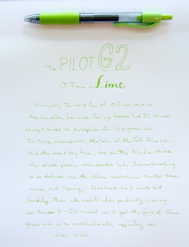
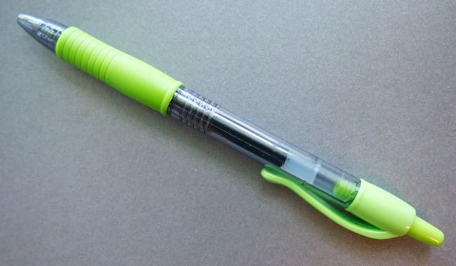
Is anyone the least bit surprised that I’m reviewing a lime green pen? Today its the Pilot G-2 0.7mm in Lime Green. I’m a relative latecomer to the joys of the G-2 line of gel pens. Most of my previous experiences have been with the versions sold in big box office supply stores that are 0.7mm and 1mm tips in the standard black and blue. Usually, pens this wide are a recipe for disaster for me so I was inclined to avoid them entirely in favor of my razor point Japanese market gels like the Pilot Hi-Tec C, Zebra Sarasa Clip and Uni Signo DX models.

But times are changing, or maybe its just as I learn more about pens and paper, I can see the appeal of different pens.

The other thing that kept me from embracing the G-2 line is that the retractable pens are just ugly. I don’t like the bulbous, curvy clip at all and the bold, brash logo-ing on them. Part of what I appreciate about a lot of Japanese pens is the absence or removeability of a lot of the branding. I like when I have to squint at a pen to see the teeny tiny word “uni” or the like as opposed to the HUGE “Pilot G-2 07” emblazoned on the clip.

Pilot G-2 0.7 in Lime

That said, there is a reason people like the G-2 ink and keep using these ugly plastic pens. They write well. They write smoothly. The ink dries quickly on most papers. They aren’t expensive (this one set me back a whopping $1.50).

Even though the 0.7mm tip is a bit wider than I am normally accustomed to, I did not have any issues with ink smudging or dry time and the slightly larger size did not create too many letters to fill in. Everything seemed fairly legible and the tip created a smooth writing experience. This pen had the same springy feedback as my previous experience. I think it has to do with the retractable button moving slightly as I lifted the pen, creating a vibration inside the pen down to the spring holding the refill in place. This may be one of the reasons I tend to favor capped pens over retractable because I don’t like this feedback. In the end though, the vibration was no better or worse than in other G-2 retractable pens. I may hack the refill out of this and put it into one a G-2 compatible pen body with a cap (i.e. the Render K G-2 model or one of the pens listed here).

How do I feel about the color? Good, really good. In my never-ending hunt for the perfect lime green pen, this is edging up the list. If it was available in a 0.5mm version, it might just be my favorite. Its a good lime popsicle green, perfect for summer ramblings.

DISCLAIMER: This item was sent to me free of charge by Jet Pens for the purpose of review. Please see the About page for more details.

Head-to-Head: Zebra Sarasa Clip 0.3mm vs Pilot G-2 Retractable 0.38mm

Pilot G-2  vs Zebra Sarasa Clip

I realized there were green gel pens I did not yet own, so I immediately popped over to Jet Pens to remedy the situation. This time, it was both the Zebra Sarasa Clip 0.3 in Veridian Green and the Pilot G-2 0.38 in Green. When they arrived I noticed how remarkably similar these two pens were to one another. The shape, the color and even the point size. So I decided to put them head-to-head to see which one was better.

Aesthetically, these two pens are almost identical. Both feature rubberized grip sections though the Sarasa Clip grip is more of a silicone material while the G-2 is a harder plasticky rubber (one for Sarasa!). Both have large capacity clips but the Sarasa has the hinged clip making it the easiest gel pen to clip on a binder or notebook cover (upper cut for Sarasa!).

Pilot G-2  vs Zebra Sarasa Clip

Colorwise, the Sarasa veridian green is a bit woodiser and, for lack of a more descriptive term, seems a little drier. The Pilot G-2 green is more of a vivid Kelly green, a bit brighter and juicier (its tough to call but I think this punch goes to Pilot!).

Overall, they both have good color, good ink flow and reasonable prices ($1.80 for the G-2 and $2.20 for the Sarasa). The score was 2:1 for Sarasa but if you’re looking for a bright green, you may favor the G-2.

Pens were tested on Rhodia Pad No. 18 Uni-blank using the Well-Appointed Desk paper guides to keep my lines straight.

DISCLAIMER: This item was sent to me free of charge by Jet Pens for the purpose of review. Please see the About page for more details.

Review: Kuretake Fudegokochi Extra Fine Brush Pen

Kuretake Fudegokochi Fine Brush Pen

Brad challenged me to try the Kuretake Fudegokochi Super Fine Brush Pen last week on The Pen Addict Podcast so I went ahead and ordered it. I’ve been on a brush pen kick lately so I saw no reason not to give this pen a try. He described it as being fine enough for writing so I was definitely intrigued.

Kuretake Fudegokochi Fine Brush Pen

The Kuretake Fudegokochi Extra Fine Brush Pen (try saying that five times fast!) is a relatively nondescript-looking pen. It has a smooth, ivory-colored barrel and a simple, metal clip on the cap. The grip area is a smooth clear plastic that lets the ink capillary fins to be visible. The tip is a very small felt/fiber tip which is quite firm. Aesthetically, it reminds me of the Pilot Precise V5 pens with slightly rounded ends.

Kuretake Fudegokochi Fine Brush Pen Writing Sample

Writing with the Kuretake Fudegokochi Extra Fine Brush Pen was an unusual experience. I tend to use a different grip and writing technique with brush pens than writing tools but this was so fine that I ended up using it like I would a regular felt tip pen or marker. It gave my writing some thicks and thins which was kind of fun. I wondered if the pen’s purpose was as a signature/sign pen for documents so I tested the waterproofiness. It ended up being a little water resistant but not waterproof so I think it would probably work for signing most things. It certainly made writing my grocery list a little more fun than the usual assortment of reject pens I normally leave in the kitchen. The gray wash that resulted from the waterproof test might be appealing to artists for loose pen sketching too.

The Kuretake Fudegokochi Extra Fine Brush Pen is $3.50 per pen. There is a wider regular version available as well as a gray version.

DISCLAIMER: This item was sent to me free of charge by Jet Pens for the purpose of review. Please see the About page for more details.

Review: Pilot Super Gel 0.5mm Green

Pilot Super Gel 0.5mm

In my endless quest to own all the green pens in the world, I stumbled across the Pilot Super Gel 0.5mm. At a whopping $1.35 I couldn’t resist picking it up. But I had to wonder…. “What’s makes it so super?”

It turns out that instead of being a slender refill inside a plastic pen body like the Pilot G-2 and other similar gel pens, the whole pen body is full of ink. Think of it as the eye dropper version of a plastic gel pen. Then there’s a roller ball tip in the end of it and a cap on the back. That’s it.

The overall design is basically no design. Its a capped, clear plastic pen. The body is a rounded hexagonal shape until you get to the grip area which is round with smooth plastic ridges to create a grippable area. There’s no silicone or rubber added for comfort and the width of the pen is similar to a round pencil.

There are both up sides and down sides to this pen. On the up side, there’s a lot more ink in this pen than a Pilot Hi-Tec C or the G-2. As well as the considerably discounted price.

On the down side, there’s the potential to break the plastic pen and have ink seeping out everywhere, think of high school and exploding ballpoint pens. The other down side is the Super Gel is a totally disposable pen. Once the ink is used, there is no way to refill it.

Pilot Super Gel 0.5mm writing sample

In the plus column, I found that it wrote well, especially at such a bargain price. It has a little more friction than some of the higher priced gel pens but not so much as to be unpleasant. In fact, if you generally find that gel pens are too slippery for your taste, this little budget pen might be appealing to you.

Finally, if you are likely to have a jar full of communal pens in your work space or home that have a tendency to walk away, this may be a great option. Its not so stylish that someone would be inclined to walk away with it while not being an unpleasant experience to use.

I know that Brad reviewed this pen several years ago and panned it but I hope that this will convince you try it and let me know what you think.

The Pilot Super Gel is also available in more traditional blue, black and red in the 0.5mm size and if you hunt around, other widths and colors may be available.

Review: Lamy Logo F Fountain Pen in Brushed Aluminum

Lamy Logo capped

I recently spotted the Lamy Logo fountain pen in brushed aluminum and clicked on the Buy It Now button before I knew what I was doing. I love the Lamy nibs for their smoothness and easy interchange-ability but I don’t like the molded grip featured in the Safari/AL-Star lines so the Logo series was a perfect upgrade. The Logo features a brushed aluminum body and a ridged grip area more conducive to overhanded (hooked) lefthanders. The cap, end, clip and grip are accented with polished chrome.

Lamy Logo Brushed Aluminum

The Lamy Logo is also a little narrower shaft overall compared to a Safari or Al-Star. If you’ve found the Safari/Al-Star to be a bit bulky in your hand, than the Logo may be a good option for you. I’d compare it to the width of a round pencil maybe a little bit wider but considerably more slender than the Safari.

Lamy nib fine

The cap is a snap cap like other Lamy pens. Its a tight snap but I suspect it will loosen over time. As it is, it will be some time before it loosens, if ever.

The Lamy Logo accepts standard Lamy ink cartridges or the Lamy comverter for even more ink options.

I purchased the fine nib version which to my writing style feels more like a medium, even in comparison to the Kaweco fine nib fountain pen. The fine Lamy nib writes smoothly so the broadness is not really a downside. Just different.

Lamy Logo writing sample

Fountain Pen Weights

The Lamy Logo weighs 17 gms, filled with a cartridge and capped so its a bit lighter than the Lamy Al-Star and unposted it weighs in at 13 gms — as light as a capped Kaweco Sport Classic.

Its a bit of an upsell at $45 from a Safari which is under $30 and the Al-Star which is under $40. But its still a good deal less expensive than the Lamy Studio or Lamy 2000. If the look of the TWSBI is not your taste, the Lamy Logo is a good alternative at a similar price point.

DISCLAIMER: This item was sent to me free of charge by Jet Pens for the purpose of review. Please see the About page for more details.

Review: Eco-Essential Pen & Pencil Set

Eco-essentials Pen & Pencil Set

Felt Flex Carry Wrap is sold separately for $15

The Eco-Essential Pen and Pencil set is a beautifully packaged product. I don’t usually swoon about packaging because I mostly want to throw it away but the Eco-Essential set came in a black, paperboard box with a white paper sleeve wrap. Simple, elegant and perfect for a gift. And because the packaging is all paperboard, it can easily be recycled.

Inside the swank packaging is not only the matching pen and pencil set but two pen refills (Pilot Hi Tec C 0.5mm in black and red), an array of colored aluminum rings to personalize your pen and pencil set and end caps to swap out with the touch-sensitive tips that come pre-installed on both tools. (The felt wrap shown in the photo is not included.)

Eco-essentials Pen & Pencil Set

I love that I was able to decide which tool, if any, had the touch sensitive tip. When swapped out, there is a stylized embossed “U” on the end. There are four ring colors to choose from: green, orange, blue and red, plus the simple black that come installed.

The Eco-Essential Pen Set started its life as Kickstarter project but it is now available directly from the Now N Then shop.

Both the pen and the pencil are aluminum cap, hardware and shell with a bamboo outer casing. It makes for a very lightweight but durable tool. The pencil is a tiny bit longer than the pen due to the click mechanism at the end. Otherwise they are virtually identical so I could see using the colored rings to make it easy to recognize one from the other.

Eco-essentials Pen & Pencil Set

Once I found the rings and cap in the box, I immediately customized my set to have matching lime green rings and flat caps. I love how the bamboo looks with the green and silver. I love the looks of these! And the bamboo feels warm in the hand. Its finished to a smooth lacquered finish but not shiny. I can feel the undulation of the wood but no burrs or roughness. I just like spinning these in my hands.

Eco-essentials Pen & Pencil Set

A nice touch is the threads on the end of the tools to attach the caps. It makes for a fairly light, long tool. I don’t think even the largest hands would find this awkward. The lightness makes it easy for longer writing sessions. The only issue is that the threaded cap hides the click mechanism on the pencil. To advance the lead, you will need to remove the cap.

Alternately, when not in use, the delicate tip of the pencil mechanism is protected by the cap so it will not poke out of bag or pocket.

Eco-essentials Pen & Pencil Set

Since both the leads (0.5mm) and the pen refill can be replaced with your favorite color, width or grade, the writing tests were mostly to get a feel for the weight and balance. I found it comfortable overall.

I did notice the absence of a clip which comes in handy for me more in keeping my pens from rolling away than actually clipping to a pocket. But its such a nice feel to have a perfectly smooth, cylindrical barrel that I can see why the design was not sullied with the addition of a clip.

Customized: Well-Appointed Desk-style!

Customized: Well-Appointed Desk-style!

The pen is available in a Pilot G2-compatible size as well as the Pilot Hi-Tec C size I received. There is also a dark finish called Incognito. A pen unit with rings, flat cap, stylus and a refill is $55 in either finish or refill size. The pencil includes the rings, flat cap and stylus tip and is preloaded with leads for $50 for either finish. A pen & pencil gift set includes two sets of rings, styli, flat caps and refills for $95. I like these so much I think I’ll be ordering the G2 model as well for more refill options*. Shipping rates are super reasonable, and quick too. I got my set in less than two weeks.

Overall, I am hugely impressed with this set. I like how flexible the options are and how well thought out the development was. I know I will noodle around with the rings and caps until the end of days because I can.

(*I’m working on a giant list of Pilot Hi-Tec C- and Pilot G2-compatible refills that I should have ready soon.)

DISCLAIMER: This item was sent to me free of charge by Jet Pens for the purpose of review. Please see the About page for more details.

Hands On: Kaweco Skyline in Mint

kaweco sport line up

Its a well-established fact that I love Kaweco pens. As fountain pens go, the Kaweco Sport line ticks all my boxes:

  • great nib
  • not too big/heavy
  • reasonably priced
  • pocket-able
  • classic looking
  • clip is optional
  • interchangeable nib system

The only downside with Kaweco was the lack of appealing body colors. Beyond black, white and aluminum, I wasn’t all that keen. I currently own two out of three of the colors mentioned, so I was starting to run out reasons to add any more Kaweco Sports to my stash. Until now.

kaweco skyline mint

When I saw the new Skyline series in Mint, I knew immediately I had to have it.  The Grey model was a very-close second. The silver hardware and nib just add to the appeal for me. I’ve enjoyed my gold-toned hardware but I’m so glad to finally have the option for silver.

The color is the softest mint turquoise color. It looks luminous even though its a simple, opaque plastic body. A ghostly almost supernatural color. I love the color. I mean LOVE it!

kaweco skyline nib

The writing experience is consistent with all my previous Kaweco Sport pens – it writes smoothly, is comfortable in the hand (when posted) and generally makes me happy to use it. I prefer to use my Kaweco Sports posted with the clip which adds just enough weight to make the pen feel more substantial. I either use cartridges or reuse an old cartridge using a syringe to fill it with bottled ink. The Skyline is no different.

Despite the likelihood that the Skyline series may be limited edition, the price point makes it a pen I’m comfortable carrying around with me on a daily basis.

kaweco skyline comparison

The Kaweco Skyline series is currently available for pre-order at Fontonplumo in the Netherlands. The Skyline is available in Mint, Grey and Black for €16.95 (about $23 US). Frank kindly sent me the first one he could get his hands on so that I could share it with you. Estimated delivery is early July.

Also, Fontoplumo is offering all Well-Appointed Desk readers a 10% discount if you enter the code WAD2014 on anything you order. This offer is good until the end of 2014. Thanks, Frank!

Review: Dixon Tri-Conderoga Pencil

Dixon Tri-Conderoga

I’ve always been a fan of the classic Ticonderoga  pencils from Dixon. Where the Ticonderoga is a classic hexagonal wood-cased pencil, the Tri-Conderoga is a triangular pencil. The Tri-Conderoga has a rubberized coating with a matte black finish.

Dixon Tri-Conderoga

What most surprised me is that the Tri-Conderoga is wider in diameter than the regular Ticonderoga or other triangular pencils. The Faber-Castell Grip 2001 is a similar shape but smaller, more comparable to a regular hexagonal or round pencil.

Dixon Tri-Conderoga

The matte coating on the Tri-Conderoga reminds me of the finish on the WOPEX pencils. Love it or hate it but I think more and more pencil manufacturers might embrace this soft-touch finish. It feels pleasant to touch and may make writing more comfortable but I kept feeling like my hand was sliding down the pencil as I wrote.

Dixon Tri-Conderoga

I did need to use a large diameter sharpener to sharpen the Tri-Conderoga. I used the KUM “Special Diameter” sharpener which worked well. This explains why Tri-Conderoga sells the pencil in a blister pack with a sharpener because a regular diameter sharpener will not work. Of course, a pen knife or an adjustable sharpener (like the Classroom Friendly or the classic wall-mounted Boston) would work as well.

The pencil performed well in writing. The lead did not crumble or flake while I wrote and the darkness was a little on the light side on the smooth Rhodia test paper. I suspect office paper or standard notebook paper which is a bit toothier would cause the line to look a little darker and probably require more frequent sharpening.

Dixon Tri-Conderoga

Since the pencil is a bit larger than an average pencils, the eraser is also a bit larger. Its a black rubber compound eraser and it ended up working better than I had anticipated. But for ease of use, I recommend using a plastic eraser like the Staedtler Mars Plastic eraser if you’ll be using any pencil.

Dixon Tri-Conderoga

I found the overall size of the Tri-Conderoga a little large for me but I can definitely see where younger folks and anyone with larger hands would find it comfortable to use. I do love the triangular shape for comfort and the lowered likelihood of rolling away when you set it down.

Thanks to RJ for sending me the Tri-Conderoga.

Review: Staedtler WOPEX Pencil Review v.2

Staedtler WOPEX pencil

When I was in Hong Kong a couple years ago, I picked up a Staedtler WOPEX pencil. The pencil I picked up did not have a ferrule or eraser on it and the paint color is a little lighter than the WOPEX pencils currently available in the US. Johnny from Pencil Revolution was kind enough to send me a couple. First, to satisfy my curiosity about any performance differences and second, because they are a lovely shade of green.

Besides being a bit brighter color (more granny smith green now), the new WOPEX pencils do not have the slight metallic flake in the paint that the older model does.

Staedtler WOPEX pencil

Both versions of the WOPEX are hexagonal, with a soft-touch rubber paint, made from the composite wood material. The cool thing about the composite material is that it makes perfect sharpening roses. As mentioned by Johnny in his review, I don’t recommend using an electric sharpener since the rubbery coating can confuse the auto-stop mechanism and chew up a whole pencil. I used a relatively new KUM handheld sharpener which worked fine.

The new pencils feature a silver ferrule and a white, rubber compound eraser on the end.

Staedtler WOPEX pencil

In writing, the leads seem to perform identically to the previous version. Its a smooth writer and I had no issues with the lead performance.

Staedtler WOPEX pencil

In the hand, the newer WOPEX pencils are not as sticky to hold. The paint/coating feels like a lighter touch was used in applying it. Its smoother in the hand and feels more like a matte finish than a squishy rubbery coating.

Staedtler WOPEX pencil

The fact that WOPEX is Staedtler’s attempt to make a more ecologically-responsible pencil is a big plus to using the WOPEX. Oddly I prefer the feel of the earlier rubber-y WOPEX but it might also be that as lovely as the new ferrule and eraser make the WOPEX look, I don’t tend to use them and they just make the pencil longer and a little unwieldy until its been sharpened a half a dozen times.

All-in-all, I think its a good pencil option and one that is readily available in your local big box or office supply store.

Review: Rite in the Rain All-Weather Notebook & 3×5 Notecards

Rite in the Rain All-Weather Notebook and 3x5 notecards

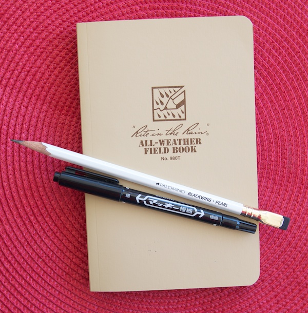
Reader RJ recently retired from the Marines and sent me some spare Rite In The Rain products to review. RJ sent me a standard All-Weather Field Book in sand, a package of 3×5 Index cards and some pens that are recommended for use with the Rite In The Rain paper.

What I learned from my experience with the Rite In The Rain materials is that, if weathering the outdoors, this paper is the bomb. It is limited in the type of writing equipment that will work with the paper though. That said, when outdoor endurance is a factor, the tools that do work with the Rite In The Rain paper work great. I compare it to hiking gear. A good pair of boots, the right wicking fabrics and cushioned, wool socks are all important but may not be the same outfit you’d wear to your sister’s graduation. Rite In The Rain notebooks and notecards are not what you need if you work in an office park. But if you go spelunking on the weekend or need a place for game notes for your rugby team, you might want to consider Rite in the Rain a viable option. If its good enough for a Marine, its good enough for your weekend camping trip.

Rite in the Rain All-Weather notebook cover

The notebook itself is a clean simple design with a soft cover tan cover printed with brown ink branding. Simple and a little bit “retro cool”.

Rite in the Rain extra pages

In the back are all sorts of tactical keys for notetaking. I was fascinated by all the various symbols and diagrams and envisioned how I might utilize them for my own short hand. Could designing greeting cards benefit from being mapped out with range card prep graphics? Probably not.

Rite in the Rain tear test

The paper itself is tan to match the cover with brown solid lines running horizontally and finer dotted lines running vertically to create a combination lined-and-gridded paper. Because of its water resistant properties I wanted to test if the paper could be torn (as shown above). It can tear fairly easily with your fingers so its not indestructible but it will resist water and live to tell about it.

Rite in the Rain Notebook

At the bottom of each page is  a scale indicator “1 square = ________” which I found charming but probably not useful for most folks, most of the time. Also, I discovered that after I had opened and closed the book a few times, it did not close flat. The book does not include a ribbon bookmark or elsatic. The binding is pretty tight which will probably make it more durable but I’d definitely recommend a belt or elastic of some kind or smash it between stuff in your backpack.

There are no added pockets or accoutrements in this notebook. If any notebook had a right to be all business and no frills, Rite in the Rain would be it.

Rite in the Rain Recommended Tools

But let’s get down to the tools and how they perform on the paper. When I started testing the papers, I used a bunch of tools trying to see how many worked. In the end, I decided to show you what did work. If you want to invest in this sort of field book, use the right tools for the job. And a fountain pen, no matter what ink you choose, is NOT the right tool.

So here goes:

Rite in the Rain recommended markers

Markers with an alcohol base work great on the Rite in the Rain paper. Basically any plastic-tipped or felt-tipped pen advertised as permanent or waterproof should work. Sharpie markers, Zebra Mackee Double Sided Name Markers, Staedtler Lumocolor Permanent, Marvy LePen Technical Drawing Pens  and even the Pilot Envelope Pen (though its a rollerball, it seems to work okay once it gets going).

Rite in the Rain recommended pencils

Pencils are aces on the Rite in the Rain paper. I tested both wood-cased and mechanical pencils and they booth work fine. Softer leads like HB  and softer worked better than 2H pencils and harder. Partly because the paper is not a crsip bright white but a soft tan so softer leads show up darker and more legibly.

Rite in the Rain recommended ballpoints

My least favorite writing tool is the ballpoint but, for Rite in the Rain, they work well. If you’ve got a drawer full of neglected dime store ballpoints, Rite in the Rain paper will welcome them and withstand the elements.

I forgot to mention that the 3×5 notecards use the same heavy weight paper in the notebook (or just a tiny bit heavier). The notecards are only printed on one side, the backs are blank which I think made them extra useful.

Rite in the Rain reverse side

But the big “ah ha!” was that there was no bleeding, feathering or show through when the recommended tools are used on the Rite in the Rain paper. That’s right. If you love Sharpies, this paper is for you. The ink sits up on the paper and does not blur or feather like Sharpie markers normally do on most paper. The same could be said for all those wide, inky behemoths like the Copic Ciao brush pen. No bleeding. No show through.

Rite in the Rain, in water

And finally, what you’ve all been waiting for… how water resistant? THIS water resistant. I drop the two notecards I used in the earlier photo into a bowl of water. Plopped them in and fully submerged them. I even let them soak for awhile until they got limp. Then I pulled them out of the water wiped them with my hands and set them on the ledge on the patio to dry.

Rite in the Rain, dry

You can see the water droplets still clinging in some places but not a bit of the ink or pencil budged.

In the end, the notebook is probably a bit too rugged for most of my needs. My idea of outdoorsy is going to a yard sale but I really like the 3×5 notecards. I think keeping a stack of these in my glove box along with an all-weather writing tool like the Rite in the Rain ballpoint. It is a perfect emergency note kit. No cup holder coffee spills will mar my next grocery list!

Final note: The Rite in the Rain products definitely got me thinking about the advantages of all-weather paper and notebooks. Despite their pen-variety limitations, in the right circumstance, its more important to capture those notes, ideas or tactical maneuvers than it is to use your favorite fountain pen. It makes me want to go back and try the Expedition Edition Field Notes again with this in mind.

(Thanks to RJ for his kindness in sharing these products with me. Its readers like you that keep this blog going and I appreciate it immensely)

Ink Review: Pilot Iroshizuku Ama Iro

Pilot Iroshizuku Ama Iro

I always think I’m not going to like blue ink. I think I expect blue to be pedestrian like those horrible blue ballpoints from school but then it would be inconceivable to compare PIlot Iroshizuku to a drugstore ballpoint. Ama Iro (Sky Blue) is a stunning blue like melted blue skies. The color is vibrant with a capital V.  It darkens ever-so-slightly when it dries but the color is still stunning.

Pilot Iroshizuku Ama Iro

I thought it had a little green in it like De Atramentis Pigeon Blue but Ama Iro is much more blue. I guess I like blue inks after all.

Pilot Iroshizuku Ama Iro is $28 per 50 ml bottle


Field Notes: Shelterwood Edition

Field Notes Shelterwood

Finally! Its the new Colors Edition of Field Notes called Shelterwood. I’m sure you’ve already heard about it already and probably already opened your order, but in case you haven’t… admire it here.

These memo books are covered with a veneer of real wood, laminated to kraft paper. Inside is the same 70lb Finch text weight stock that Coudal has previously used in the “America The Beautiful” edition, this time with lines in “Maidenhair Green”. The staples are gold toned and the logo is silkscreened on the covers in white.

Field Notes Shelterwood

Other people have mentioned it but once the shrink wrap is removed, the books don’t close completely. The covers still feel fairly flexible though I probably wouldn’t risk folding the cover all the way back on itself for fear of cracking the spine.

Since I carry my Field Notes in a leather cover, the not-quite-closed covers don’t bother me at all. If you’re inclined to carry them in a shirt pocket, this might be a little annoying.

Field Notes Shelterwood

Opening the package, the books smell so good. It was like the books were imbued with fresh pencil shavings.

Field Notes Shelterwood

You’ll notice the book in the middle has faint “tan lines”. I had the books in the shrinkwrap with the belly band on, laying on my desk for about a week. For whatever reason, that caused the uncovered parts to darken slightly. If you are hoping to keep your Shelterwoods MINT, keep them out of the light.

Field Notes Shelterwood

Since the paper is similar to America The Beautiful, I didn’t do an extensive writing test. I know that some, but not all fountain pens, pencils, gel and ballpoints work great and markers like Sharpies will bleed terribly. So this time, I just lined them up and gave them a quick test. Results were consistent with the America The Beautiful.

If you love Field Notes, you’ll want to grab this limited edition while you can. If this is your first foray into Field Notes, be aware this is very different product from the regular editions. Enjoy it, collect it but just know this is something a little different.

Review: Copic CIAO Markers

Copic Ciao 6-pack color set

I recently bought the Sea colors 6-pack of the Copic CIAO markers. The set comes with four, watery colors plus black and a clear blender. Each marker uses an alcohol based permanent ink and features a brush tip on one end and a chisel tip on the other.

Untitled

In general, I think the Copic line of markers is popular with illustrators, particularly those in the comic book and/or animation business. When I was at the local comic book convention last month, I saw a lot of the artists had Copic markers in their kits. The CIAO is a smaller, less expensive version of the professional Copic Markers.

Writing Sample Copic Ciao

I absolutely love the springy quality of the brush tip. Its great for lettering. I’m a doofus with the wide chisel tip though. I blame my left-handedness.

Overall, the colors in the set were pretty though I never figured out quite how to use the blender pen. Because of the lightness of the colors, there was a little washiness in the colors that was not intentional.

After playing around with the Sai Watercolor markers, I was even less interested in the Copic CIAO markers but I suspect that these markers are not really made for the casual user. They reminded me a lot of the old DESIGN markers we were supposed to use in art school for “marker renderings” back in the day when digital photography and mock-ups were too expensive so artists would do a realistic drawing to show potential clients.

When dry, these inks were virtually waterproof which means that other water-based media, colored pencils or paint could be added to a drawing or calligraphy piece. On the right edge, I liberally applied water from a paint brush onto the markers after they were dry for a minute or so and the colors didn’t budge.

Reverse side of Copic Ciao Writing Sample

Then there was the bleed through issue. If you need markers like these for illustration purposes or for the waterproofiness, then the bleed through may not be an issue. For me, they bleed so much as to not be suitable for sketchbooks or even envelopes.

I will definitely use the black for calligraphy with the brush tip and the chisel end for labeling boxes (like a Sharpie Marker), but the other colors might not get a ton of use for my purposes. If I stumble across an illustrator or a young would-be illustrator, I will gift them the set.

Bottom-line: These are not for the casual user but more valuable to the artist, illustrator, animator or art student using heavy duty illustration board, specialty “marker paper” or the like.


DISCLAIMER: This item was sent to me free of charge by Jet Pens for the purpose of review. Please see the About page for more details.

Review: Sai Watercolor brush markers

Untitled

My friend Madeline of Tag Team Tompkins introduced me to the Akashiya Sai Watercolor Brush Pens and within minutes, I had to order a bunch of my own. What makes these so awesome, you ask? Well, for starters, these brush pens have real bristles at the tips so they will behave more like a real brush than any of the brush pens with felt tip or polyester points.

Then, there are the amazingly awesome colors! There are complex colors like the yellow ochre, pale-almost-there colors like the pale orange and vivid brights like the vermillion orange and lime green. Individual colors are $3.50 each but sets are also available in seasonally-inspired sets of five ($17.50 each) or a 20-color set ($70).

Water test with Sai Watercolor Brush Pens

These pens are water soluble which means you can thin the colors with water to make lighter wash or blend two colors together. I used a water brush to blend through and only lightly brushed the color with water to make the color all washy here.

If you’re not falling over in your chair with the urge to buy one or a whole set of these wait until I tell you a few more things.

Sai Permanent Outline Brush Pen

What if I told you there is also a permanent outline brushpen ($5.25) that can be used to create permanent lines like the leaf I drew in the top writing sample and then applied the water soluble colors over it? Now are you excited?

Sai watercolor brush pens writing sample, from the reverse. On Rhodia.

When I flipped this writing sample over… there was no bleed through, or even any show through. Seriously. Keeping in mind this writing sample was done on good quality Rhodia paper stock but still… that’s pretty cool for thick, juicy markers to not show through at all. Or maybe that just speaks very highly of the Rhodia paper?

Okay, one more thing and then I think my case should be made. There is a special assortment of extra fine line pens called ThinLine ($4.95 each or a set of all five for $24.75) that come in a few select colors of deep rich hues that are also waterproof when dry and perfect for outlining. With colors like Greenish Indigo and Sumi Black, how can you resist the temptation?

Are you suitably enticed?


DISCLAIMER: This item was sent to me free of charge by Jet Pens for the purpose of review. Please see the About page for more details.

Review: Etranger di Costarica Memo Book

Etranger di Costarica Memo Book

The Etranger di Costarica memo book is a simple, little, pocket-sized notebook. The appealing thing for me was ,of course, the transparent plastic cover in a gorgeous lime green. I was really hoping that the cover would be the right size to fit over a standard Field Notes. Sadly, the Etranger di Costarica memo book is a tiny bit smaller than a Field Notes (or other pocket notebook) measuring at 3.3 x 5.4″.

The cover is printed with a little mail carrier icon and the words “mettre le courrier à la poste le courrier est arrivé”, which roughly translates to “put the mail in the post, the mail has arrived”. How can I not like a postally-themed memo book?

The book itself is a white gloss-coated cardstock cover, inside a transparent flexible plastic cover adding a little durability. The book has black paper end papers and a stitched binding (not staples, actual stitching). Inside the paper is white with grey lines and red margin lines, top and bottom. The lines are spaced at a snug 5mm, good for people like me who tend to write smaller than most. The book has rounded corners which I always think make a book look “finished”.

Etranger di Costarica Memo Book

In writing tests, I was pleased with the paper quality. There was no feathering or bleeding though my line widths looked a bit wider on this paper than in other instances. Ah, the strange and wonderful mysteries of paper!

Etranger di Costarica Memo Book

Despite a bit more absorption on the front of the paper, thus creating a but wider line, from the back there was no noticeable show through or bleed. I did not challenge it with a Sharpie marker as we can all assume it will bleed through as it does on any paper that is not corrugated cardboard.

At $3.30 per book, its only slightly more expensive than the standard pocket memo book and since is has a plastic cover, I assume that’s the additional cost. There are eight other cover colors plus clear and refills can be purchased for $1.65 each. Excellent value!

I like the size, the simplicity and the lines. While this won’t replace my Field Notes in the long run, its a nice addition to my notebook arsenal.


DISCLAIMER: This item was sent to me free of charge by Jet Pens for the purpose of review. Please see the About page for more details.

Review: Banditapple Carnet Notebooks

Banditapple Carnet

Banditapple Carnet

I recently got a selection of Banditapple Carnet notebook samples. I wanted to see the whole line so I got all the samples that were available. Two of the book were the “handy notebook” which is 11x21cm, the same size as the large Midori Traveler notebooks. The smaller book, the “peewee”, is the same size as the Midori Traveler Passport refill. The last book is a bit wider than the “handy notebook” approximately A5 (13x21cm) and is an undated weekly planner notebook.

Banditapple Carnet

Banditapple books are handmade in Vietnam and distributed by the Banditapple Company out of South Korea.

Each book features a card stock paper cover and a matching stitched binding. The books I received are in the Finland Pine, Gingerbread and Hanoi Red.

Banditapple Carnet

The inside papers are different. The grid passport-sized and the weekly planner had white paper while the blank and lined books have ivory colored stock. The ivory stock is described on the packaging as 3G Heritage NT paper while the white paper is just listed as Heritage Paper. All the stocks are 80gsm and printed with soy inks.

Banditapple Carnet

The Weekly planner has 52 weekly + blank pages and all the other books featured 64 pages of paper.


Banditapple Carnet

The grid paper is 5mm grid lines. There’s some debate at my house whether the lines are dark blue but I think they are. The paper is really pleasing to write on and there was no bleeding or feathering with any of the pens I tried.

Banditapple Carnet

From the flipside of the paper, there is no show through at all.  Not even a hint.

Banditapple Carnet

I also tested the lined paper of the larger “handy” notebook. The lines were spaced at 6mm and look more grey than blue. I decided to up the game and try the alcohol-based Copic Superbrush to see if the ink would bleed or showthrough since the stock is the same weight as the white grid stock.

Banditapple Carnet

The Copic Superbrush did bleed through but it was the only ink that did. From a daily use standpoint, I prefer the soft, warm color of the ivory stock. And I prefer the grey lines of the lined paper over the darker blue lines of the grid paper.

Banditapple puts its books through their own tests on their Tumblr page. But I am already sold. Especially if you are a user of Midori Traveler leather covers. The Banditapple notebooks area little less expensive than the Midori refills and I like the paper in the Banditapple Carnet notebooks much better. Now I guess I need a large Midori Traveler. Oh, darn.

The best US source for Banditapple Carnet notebooks is Goulet Pens, prices range between $3.50-$5.50. If you know of other shops or online vendors who are stocking Banditapple Carnet notebooks, leave the info in the comments.

Review: Moleskine Art Plus Sketch Album

Moleskine Art Plus Sketch Album

I spent the better part of the last week trying different tools on the new Moleskine Art Plus Sketch Album (large, 72 pages, $13.95) as well as comparing it to the standard Moleskine paper and the “Sketchbook” paper. The reason I spent so much time with it is that it is the first big push Moleskine has made to tout a “better” paper stock. It is listed as 120gsm/81lb paper. Moleskine has also started listing the weight on the Sketchbook paper. I think it says 165 gsm but its hard to see the label on the site.

Moleskine Art Plus Sketch Album Comparison

I purchased the A5-sized book. Its a horizontal or reporter-style format. The new Art Plus Sketch Album does not have many of the elements usually associated with Moleskine notebooks. It has cardstock paper covers, no elastic and only a slit pocket in the back cover. Every page is perforated. The Art Plus Sketch is only available in a few sizes, blank paper only.

Moleskine Art Plus Sketch Album

The first thing I noticed when comparing all three books and papers is that the shade of ivory paper is different for each book. The classic “sketchbook” paper is the most yellow, than the traditional plain paper is a little lighter and the new Art Plus paper is the lightest cream/ivory of all three.

Moleskine Art Plus Sketch Album Comparison

At first, I tested just the Art Plus Sketch Album paper and while the tools I was trying seemed to work well I couldn’t be sure how it compared to the original paper or the “sketchbook” stock so I had to switch to a head-to-head comparison.

Moleskine Art Plus Sketch Album Comparison

I wanted to test an array of materials as Art Sketch Plus somehow suggests an ability to withstand art-grade materials, possibly ink washes, markers and other tools. It’s more firepower than I would normally throw at a notebook but I really wanted to put it through its paces.

Moleskine Art Plus Sketch Album Comparison

Moleskine Art Plus Sketch Album Comparison

There was a little  feathering with my TWSBI Mini EF and the Pilot Iroshizuku Ku-Jaku ink. The Copic alcohol-based CIAO superbrush pen bled through to the back vividly but did not smear or bleed on the paper. The Noodler’s Creaper flex nib was all kinds of feathery mess. I had a bit of a drying issue with the Retro 51 though I did not time it, within the normal time it took to switch tools, my hand did smear the ink. I didn’t see any other notable dry time issues though.

Moleskine Art Plus Sketch Album Comparison

Moleskine Art Plus Sketch Album Comparison

In comparison, the traditional Moleskine plain paper (large reporter, 240 pages, $18.95) had similar results with most tools. The Noodler’s Creaper splines and feathered way worse but the results of the other fountain pens was consistent to the Art Plus Sketch Album stock.

Moleskine Art Plus Sketch Album Comparison

Moleskine Art Plus Sketch Album Comparison

The Sketchbook (large, 80 pages, $19.95) stock had the best results with pen and ink with the least amount of feathering or bleeding.

The bleed through and show through for all three books was as to be expected. The plain paper had the most show through and bleed through making the reverse of the stock useless. The Art Plus Sketch Album had visible show through with all fountain pen inks, the worst being the flex nib and the big, bold Copic brush. If you’re only using felt tips, gel pens and the like, you might be quite please with the usability of the Art Plus Sketch Album. The sketchbook paper had the best two-sided usage. Only the Creaper and Copic had show through on the Sketchbook paper.

After all the testing, I will admit that the Art Plus Sketch Album stock is a minor improvement over the original Moleskine paper but the sacrifices (no hard cover, lines/grid, no elastic or gusseted back pocket) don’t really validate the increased price and loss of features.

There will not be a bonfire after all but I’m not blown away by the new Art Plus Sketch album either. Can I rate it “meh”?

Ink Review: Noodler’s Bad Green Gator

Noodler's Bad Green Gator

I was so excited to get a bottle of Noodler’s Bad Green Gater ($12.50 for a 3 oz. bottle). A bulletproof green? This should be a win-win for me. But I have to confess that I was severely underwhelmed by this ink. Yes, it is waterproof. Yes, it is green. But the color is very flat and dull. It lacks a richness or a pizazz. When its wet, it has more depth and  zing so I had such high hopes. When its dry, its just BLAH. The hunt for the perfect green ink continues.

This ink was tested with a hacked Pilot Prera with a Plumix calligraphy nib on Rhodia plain paper pad.

Ink Review: J. Herbin Rose Cyclamen

J. Herbin Rose Cyclamen Ink

As the weather warms up and I’m seeing the first peeks flowers and trees budding, I decided it was time to get out some brighter inks. I had this J. Herbin Rose Cyclamen ($9 for a 30ml bottle) from the massive ink haul I won last year from Julie B over at Pens Paper Inks … Whatever. I’m not normally inclined to purchase pink inks, Pelikan Edelstein Turmaline Color of the Year not included, but I was getting the itch to use an ink that wasn’t blue-black. So the J. Herbin Cyclamen found its way into circulation and, boy, am I glad it did.

I painted the title with a paintbrush and then wrote the writing sample using the Pilot Plumix calligraphy nib currently residing on my “spare” lime green Pilot Prera. Following the nib hack a couple weeks ago, a reader (Denis) mentioned that this hack also worked with Preras. Since I had a Prera with a too-fine-for-me F nib, this seemed like a great way to make it useful again. Besides, the pink ink in the lime green pen made me think of Lilly Pulitzer summer resort dresses.

J. Herbin Rose Cyclamen Ink writing sample

It’s a very purple-y pink, more raspberry than a fuchsia or hot pink. It really is the color of a Cyclamen flower.

(via Wikipedia)

The ink has a little shading but not much and its not as noticeable once the ink is dry either. But overall, J. Herbin ink is very reasonably priced and offers vivid colors that brighten my day.

J. Herbin Rose Cyclamen Ink Pink comparison

For comparison, here are some swatches of other pinks I had on hand. From left to right, Diamine Deep Magenta, J. Herbin Rose Cyclamen, J. Herbin Rose Tendresse, DeAtramentis Dianthus, Platinum Cyclamen Pink (actually neon which was hard to capture in a photograph), Diamine Hope Pink (also neon bright) and Pelikan Edelstein Turmaline (no longer available).

To be honest, I found very little difference between the J. Herbin Rose Cyclamen and Rose Tendresse. I find the Cyclamen a tiny bit deeper and a little more complex and the Tendresse a tiny bit brighter. I think the Tendresse looks like it would shade a bit more. The De Atramentis Dianthus is very similar in hue, maybe a tiny bit brighter and it is a scented ink. I could only smell it slightly when it was wet and was lightly floral. When dry, there is no scent. The only other color close (in my collection) was the Diamine Deep Magenta which was more of a deep, dirty pink not as raspberry purple as the other three mentioned. The Platinum Cyclamen, Diamine Hope Pink are much pinker and neon when wet. They both dry to a vibrant pinky-red. The Pelikan Edelstein Turmaline is the most subdued as a deep, complex red/pink/brown.

Do you ever use pink ink? What’s your favorite?

Review: Campus A4 Pad

Campus A4 Pad

Beneath the rather banal cover of the Kokuyo Campus Report Pad A4 ($4.10), hides some pretty amazing paper. When I first peeled back the flimsy cover, I was greeted by the undersheet and went “Hmmm, is this what I ordered?” After flipping past that, I realized that the paper was actually blissfully blank and a very lightweight. It reminded be a little of the Tomoe River paper found in my Hobonichi Planner. Do I have you attention now?

Campus A4 Pad

The undersheet is conveniently printed on both sides. One side is just lined, the other side is marked with a grid.

Campus A4 Pad

The paper is lightweight enough that you can easily see the lines or grid undersheet through the paper. The undersheet is more heavyweight than the paper so it feel like it will be durable enough for use through a full pad of paper, even with the possibilities of ink transfer.

Undersheets are one of the reasons I love blank paper. If the paper light enough, or your undersheet is dark enough, you can quickly have lined or grid paper to work from but then not be distracted by the lines once you’ve written on the paper. If you’re sketching, you can skip the undersheet altogether and you have a clear, blank of expanse to inspire you. With blank paper, you get the best of all worlds.

Campus A4 Pad
Now, how well does the paper perform in writing tests? Excellently, that’s how. I put it through its paces with gel, rollerball, pencil and fountain pens and not one bled or smeared. I didn’t track dry times but even with my smeary, left-handedness, I didn’t have any smudges. The only pen that led through was a Sharpie marker but I tried it just to see if it would.

Campus A4 Pad

From the reverse of the paper, you can see that there is quite a bit of show-through because the paper is so lightweight but nothing leaked through except the Sharpie, which I expect on all paper but cardboard boxes. I like this paper so much, I considered putting it in the queue as a regular pen testing notebook so I thought I better compare it to the current reigning champ, the Rhodia No. 18 Uni-Blank.

Rhodia Pad vs. Campus Pad

The Rhodia pad paper is on the left, the Campus pad is on the right. As you can see, the Rhodia paper is considerably brighter white. The Campus pad is a soft white. Which, for my purposes, rules the Campus out for ink testing since I like to be able to clearly see the colors without any color pollution as a result of the paper.

Rhodia Pad vs. Campus Pad

From the reverse, its easy to see that the Rhodia is a thicker stock so there is little show-through. I added the Sharpie marker just to have something bleed through so my camera had something to focus on.

If cost is an issue and you are looking for a lay-flat writing pad with easy, tear-away sheets AND is fountain pen-friendly, the Campus Report Pad is a great option. Its considerably cheaper than a Rhodia No. 18 pad and very similar size. For US folks, the A4 size is about an inch taller and a quarter inch narrower than “letter-sized” paper so fitting the sheets into a 3-ring binder or standard file folders might not work as well as the Rhodia No. 18 which perforates down to a standard letter-sized sheet.

DISCLAIMER: This item was sent to me free of charge by JetPens for the purpose of review. Please see the About page for more details.
Word Cards + Ink Drop = Ink Organization

Word Cards

I picked up this stack of Kyokuto Word Cards at Maido in San Francisco. They are small cards measuring just 1.5″ x 3.5″ (3.7 x 9 cm) and contain 100 sheets. I paid $2.75 for them. They are hole punched  at the narrow end and held together on a clamp ring making them perfect to store and collect ink sample swabs. Because the clamp ring is easy to open, ink samples can be rearranged by color or manufacturer on a whim.

I’ve started using them to have swab references of the Ink Drop colors I receive. I plan to go back and do all the previous color swabs so that I can get all OCD and mix and match them by color, which ones I’ve purchased and manufacturer at a whim.  The paper quality seems good, only one ink swab of the ten I tried showed any bleeding or feathering. Its bright white and my printer husband estimates the paper weight between 60 lb and 80 lb cardstock. Think of the card stock used for magazine blow-ins (those subscription cards that fall out the first time to open it) for a comparable weight. The cards are very smooth paper, there is little-to-no texture.

The nice thing about this set (or any of these mini-flash-cards-on-a-ring) is the ability to add more cards as needed. If they exceed the ring capacity, larger rings are available in most office supply stores or I can split the colors between multiple rings or divide them into smaller rings — all the reds, all the blues, all the blue-blacks, etc. I just love how easy it is to review, sort and be as anal about my ink collection as I want to be.

The closest product I could find online is the Maruman Mnemosyne Word Cards which measure 4.1 x 2.1″ (5.4 x 10.5 cm) with 100 sheets for $4.95. For more about the Maruman Mnemosyne Word Cards, check out the review on The Pen Addict. Have fun and nerd out with your new ink cards!

Word Cards Ink Drop

Review: Mitsubishi Hi-Uni HB

Mistubishi Uni Pencil writing sample

The Mitsubishi Hi-Uni HB is on of those pencils I’ve always wanted to try. I found this one at Maido in San Fransisco. Hi-Uni pencils can be purchased individually on Jet Pens for $2.35 each.

The lead has no friction on the paper. I definitely see the appeal of this pencil. It feels fabulous in the hand and lays down a smooth line. The HB lead smudges only slightly and it erased completely with the Staedtler Mars plastic eraser.

The red-brown lacquer on the pencil feels silky in the hand. The branding is stamped in a crisp, gold foil including the grade on the black lacquer-dipped end. The branding includes the tag “Established 1887” as well. There is a gold foil ring around end of the pencil just before the end. The Hi-Uni line does not have an eraser tip, just the lovely black lacquer end.

On the very end of the pencil is a bright yellow dot. I did not look closely when I purchased the pencil to see if each grade had a different colored dot or if they were all the same but its an interesting design detail.

There is a white bar code stamped on the reverse side of the pencil from the branding, near the point. I’m not sure if this is just on the pencils for individual sale or if it would appear on pencils purchased by the box. It’s the only eyesore on an otherwise beautiful pencil.

Mitsubishi Hi-Uni HB wood pencil

Mitsubishi Hi-Uni HB wood pencil

Review: Beans Cut Mini Scissors

Raymay beanscut

While in San Francisco, I picked up the Raymay BeansCut mini scissors. It is a teeny tiny pair of snippers and a side slit for opening envelopes. Its extreme portability and fine jelly green color made it something I really wanted to try. At $6.50, it seemed like a reasonable investment, one way or another.

Raymay BeansCut

I wanted to compare it to my usual letter opener and you can clearly see that the BeansCut is considerably more portable. The flipside is that the scissors are so tiny  (compared to a dirty pair of 4″ scissors I keep on my desk) that they are only usable for snipping threads, trimming washi tape and possibly opening taped packages. Alternately, as a knitter, its a perfect tool to snip yarn and its small size made it easy to fit in my knitting kit.

When I tested the slicer on the side for opening envelopes, it worked well on plain paper envelopes like bills and air mail envelopes, but if the envelope was even slightly heavier like a wedding invitation it really didn’t work very well. I ended up using the scissors to open heavier paper envelopes and the slicer for lightweight papers.

The Raymay BeansCut is available in four colors from JetPens for $6.50. I bought mine at the Maido shop in SF in Union Square.