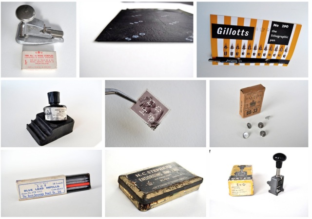
His (or Her) Majesty’s Stationery Office

Collage of images from H.M.S.O.

This is a fascinating collection of vintage office supplies from the official Stationery Office of the King or Queen of England. The office was in existence for over 200 years providing office supplies to civil servants. Each item is marked with the letters “S.O.” and a crown. Lito has collected and beautifully photographed dozens of products from the S.O. Check out her Flickr Album to see and read more about the items.

(via Lito Apostolakou of Palimpest and Inklinks)

Kickstarter: Qwerkywriter

Qwerkywriter

Even typewriter lovers among us occasionally have to use a modern-day computer. Why not experience the beauty and feel of a vintage typewriter while you pound out your emails or Twitter missives? That’s where the new Kickstarter Project, the Qwerkywriter comes in. Its a USB keyboard (though there are plans for a Bluetooth adaptation if they exceed funding) that has a 88-key mechanical keyboard with the classic good-looks of a vintage glass-key typewriter. The “paper feed” doubles as a tablet stand for your iPad or Android tablet.

At the $289/$299 funding level, you can receive this unique keyboard. The developer is about a third of the way to his funding goal so if you’d like to see this project come to fruition, support it today. The funding period end July 3.

Qwerkywriter with tablet

Esterbrook 9314F: Fine Stub

Esterbrook 9314F writing sample

Do you ever come across a pen or a nib you think “this is my signature pen?” The one that makes your handwriting look better without doing anything but using it? That’s how I feel about the Esterbrook 9314F Relief Fine Stub. Its from the “higher end” line of nibs from Esterbrook, the Master series and I was lucky enough to borrow a NOS version from Harvey  from the blog, My Antique Pens.

Esterbrook 9314F nib

The 9314F  has a nib that is flat at the tip like a stub but its angled slightly down to the left. I had previously fallen in love with the 2442 Falcon nibs which also have the angled nibs but this was my first opportunity to compare Durachrome (the 2000-series) to Master Points (the 9000-series) Renew nibs in a head-to-head. I guess its almost a head-to-head since there is also a 2314F nib that is labelled a “Fine Stub”. I am not sure what the difference is between the 2442 fine stub and the 2314F fine stub so I guess this is as close as I’ll get at the moment.

Esterbrook 9314F writing and comparison

It became obvious when comparing the three nibs that my original, well-worn 2442 is definitely lost its crispness but it writes very smoothly and consistently. The NOS 2442 writes similarly to the 9314F but I noticed that the finest cross strokes were not quite as fine in the 2442.

Esterbrook nib drawing

I still feel like I’m learning about falcon nibs, this sub-category of nibs. Some say the Falcon (also called Relief) nib is designed for people who write with a backwards slant. Others say it was meant for left-handed writers. For a bit more information about Relief/Falcon-style Esterbrook nibs, this thread on FPN is quite enlightening.

What I discovered with all three of these nibs is that I can easily write with them and get a broader stroke with some pleasing thins without altering my left-handed, overhanded writing position. I often have difficulties with broad nibs entirely and wider stub nibs are a challenge as I can’t always get the nibs to make even contact with the paper. Ah, the challenges of lefties!

Esterbrook 9314F writing close-up

(A huge thank you to Harvey at My Antique Pens for letting me take this little rarity out for a spin)

(UPDATE: Corrected post title and link to Harvey’s blog. Sometimes, I swear I should not be allowed near a keyboard before 10am and a WHOLE pot of coffee!)

A 300-Year-Old Color Swatch Book

colors-1 colors-3

If you think we pen geeks get a little OCD about documenting our new fountain pen inks or testing papers in various notebooks, then you’ll appreciate this. In 1692 an artist created an 800-page handwritten book of paint swatches and documenting color at that time. Many comparisons are being made between this book and the modern day Pantone swatch books. Pretty epic, huh?

colors-5

There are even more photos available to view, all collected in hi-rez though the server is clearly overburdened at present.

(via Colossal and linked from Erik Kwakkel. Thanks to Bob, Teri and everyone else who sent me the link)

The “Upstairs” Typewriters

I admit it. I have a typewriter collection. All my machines are manual typewriters, no power needed other than my fingers bashing about on the keys and a good ribbon.

When one must describe a portion of the collection and the  “upstairs” typewriters, clearly there’s some typewriter hoarding going on here. The “upstairs” typewriters are mostly functional, though the Royal Royalite is being moved downstairs until I can get it fixed, or at least looked at by a professional to see if its worth fixing. The others are diamonds, or at least diamonds in the rough.

The "Upstairs" Typewriters

After getting my new Lettera 22, I just had to see how much overlap there is in the collection and was pleasantly surprised to discover there isn’t any. Okay, technically, there is a “spare” super-wonky Hermes Rocket in the basement that needs to be repaired but that’s the only case where I have two of the same machine. But, seriously, no self-respecting typewriter collector would ever walk away from an Hermes Rocket. Nope. Not a chance.

So, would you like to see how these all type?

Royal Royalite Typing sample

This is the wonkiest of the bunch, the Royal Royalite but I love the typeface so much I’m willing to see what it would take to fix it up. Besides, it has one of the most beautiful shapes of all my manual typewriters. I bet Mary Tyler Moore, or maybe Rhoda would have typed on a machine like this.

Olivetti-Underwood Lettera 22 typing sample

This is my newest acquisition, the Lettera 22. It needs a new ribbon but it has instantly made it into my top three typewriters. It requires a pretty light touch for a manual typewriter and has no noticeable flaws in performance. What a score this was!

Hermes Rocket typing sample

I want to love this Hermes Rocket, I really do but it has a wonky ribbon advance and it cuts off the ink on uppercase letters. The ribbon might be too big for the machine or something but its been nothing but frustrating.

Adler Tippa typins sample

Oh, Adler Tippa, how I love you! This is my coup de gras of typewriters. It was in pristine condition when I bought it on Craig’s List and the cursive script face was a total bonus. This is one of those items I’d be sure to grab if there was a fire/tornado/etc.

Smith-Corona Empire typing sample

I think the only flaw of the Empire by Smith-Corona is that it was never really used and could use some oil. Otherwise, its a little trooper with some sticky keys.

Webster Brother XL-747 typing sample

My Brother/Webster is not the prettiest machine in the house, even with its shiny blue paint, but it has been a workhorse. I found it at a thrift store and paid $20 at the time which my dear husband thought was ludicrous. Poor delusional boy. The red ink is running dry on the ribbon but this machine stills gets used more than any other.

Do you have a typewriter? Or several?

Typewriter Acquisition: Olivetti-Underwood Lettera 22

Olivetti-Underwood Lettera 22

I’m an equal-opportunity office supply junkie. Pens? Yes, of course. Paper? Yep. Staplers, paper clips, clipboards? Don’t mind if I do. And the coup de gras of old office goodies, manual typewriters? Oo la la!

This weekend we went out to our favorite antique mall which is often a hot bed of vintage office supplies like old staplers, pocket notebooks with feed store logos and the occasional bullet pencil but typewriters tend to be of the dusty-and-rusty variety and never anything serviceable or useable. Until this weekend when I stumbled across a minty Olivetti-Underwood Lettera 22.

Olivetti-Underwood Lettera 22

The mall was having a “meet the vendors” night with free cocktails and hors d’oeuvres and special discounts on merchandise so this fine piece of mid-century mechanics was 35% off. I grabbed this beauty and hopped to the register faster than you can say “shabby chic” and then we headed over to Skylab Letterpress to do some light cleaning and oiling.

Olivetti-Underwood Lettera 22

It cleaned up beautifully and the keys work beautifully. I just need to order a new ribbon for it. It has a switch for two-color ribbon so I’ll keep that in mind when I order a new spool.

Sadly, the typewriter no longer had its carrying case so I’m keeping an old bit of fabric over the top of it to keep it from getting dusty until I find a case for it. Holler if you happen to find one!

Olivetti-Underwood Lettera 22

Do you peruse thrift stores, antique markets or yard sales for vintage office supplies, pens or pencils?

Happy Ester(brook) Sunday!

esterbrook-sunday

Spring is the perfect time to pull out the Esterbrooks, dust them off and see which ones need a little spring cleaning. This is my whole Esterbrook collection and I can see a gaping absence of a brown or rootbeer model as well as a need for several more pastel pocket pens to fill out my collection. And I don’t have even one mechanical pencil.

Happy Ester(brook) Sunday!

Of the eight shown, five are in full working order with nibs installed. Two have my favorite stub nib, the Falcon Fine Stub 2442, the gray on the left has the legendary 9128 flex nib, the pastel pink has the 9788, the blue has the 9550.

Of course, while I had the pens out, I felt it necessary to do a little record keeping so I created a little spreadsheet inventory of the nibs I currently have and which pen they are residing in.

nib #

description

box?

in pen?

1550

Firm extra-fine, Bookkeeping

no

2284

Firm Stub, Signature Stub

yes

2442

Fine Stub, Falcon

yes

grey pearl

2442

Fine Stub, Falcon

no

red pearl

2556

Firm fine, Fine Writing

no

2556

Firm fine, Fine Writing

no

2668

Firm medium, General Writing

no

2668

Firm medium, General Writing

no

9128

Flexible Extra Fine, Fine penmanship (Pitman shorthand) 

yes

grey pearl

9550

Firm Extra Fine, Bookkeeping

no

blue pearl

9555

Firm Fine, Shorthand

yes

9555

Firm Fine, Shorthand

no

pink pastel

9556

Firm Fine, Fine Writing, Records and charts

no

9668

Firm medium, General Writing

no

Clearly, I have more nibs than pens but not nearly all the possible nib options that are available:

(image via Rick Binder)

(image via Richard Binder)

I would really like to try the 9314F Master Point version of the Fine Stub, the 2048 or 9048 “Shaded Writing” and several others. Like jelly beans, with Esterbrooks, you can’t have just one!

Happy Ester(brook) Sunday!

What’s The Big Deal About Vintage Pencils?

IMG_0517

I realized I’d never really talked about what I like about vintage pencils, beyond the obvious that they look cool and are old and are often relics of domestic factories of companies still in business. So I thought I’d take a moment to show you some vintage pencils in action.

Vintage Pencils

One of the great things about vintage pencils is that, no matter how old they are, they are going to write if you sharpen them. If it has an eraser, avoid it completely though. The erasers will dry out in a matter of a year or two so trust me when I tell you that a 40 year old eraser will either do nothing at all or leave a dark smudge on your paper. So don’t bother with it. But the lead? Its all good.

Vintage Pencils

Some pencils will have unusual grading as opposed to the modern B (for black or soft leads) and H (for hard and therefore lighter leads). Some vintage pencils may simply say HARD or VERY HARD like the ones shown above or a combination of text.

In the past, pencils were used for lots of purposes beyond just Scantronic tests and math homework. Remember, the pencil had its heyday in the world before computers and the power of the undo.

I have a few “film lead” pencils that were designed to write on plastic film for printing or photography. Hard lead pencils were favored by draftsmen and artists and soft leads could be used to write on wood. Pencils allowed folks to apply pressure to their writing in order to easily and cheaply use carbon copies like a store receipt or invoice.

IMG_0518

This is a writing sample of several of my vintage pencils. There were three stand-outs in writing quality: the Futura Medium F, the Eagle Chemi*Sealed Mirado 174 and the USA Black Flyer 4500. I was stunned at how smoothly they wrote.

I also loved writing with the Press 260 Jet Black. It reminded me of the Faber-Castell Design Ebony pencil and the General’s Layout Extra Black but when I compared them, The Press 260 was light years darker and smoother. If you like either of those modern pencils, its worth it to seek out the Press 260 Jet Black.

IMG_0519

On the second page, I wanted to also include some modern pencils so you could have a point of reference for how dark or light the writing is.

I would say that the USA Black Flyer is comparable to the Blackwing 602 but the Flyer is a smooth round barrel while the Blackwing is a hexagonal. The Flyer is unfinished on the end. Potentially, you could sharpen it from both ends or add an eraser cap were you to find one of these at a yard sale. The Faber-Castell Grip 2001 has a similar feel, graphite-wise, to the vintage Mirado but the barrel shapes are different, not to mention the overall appearance.

I love modern and vintage pencils with equal enthusiasm. Would I give up my stash of modern Blackwing 602s for another vintage Mirado? No way. I like having the chance to sample old pencils like rare, fine wines. I enjoy them while I can and save the little, stumpy ends like corks. And modern pencils provide me with a steady stream of writing enjoyment.

Writing sample was done on Rhodia blank pad and all erasing was done with a Staedtler Mars Plastic eraser.

A.W. Faber Sure-Grip 6803 Clutch Pencil

A.W. Faber Sure-Grip Clutch Pencil

Thanks to the fact that my neighborhood is filled with artists both working and retired, yard sales tend to be a jackpot for vintage office supplies. This little gem is a vintage A.W. Faber Sure-Grip 6803. Its a clutch-style leadholder pencil that takes 2mm leads. These are popular with architects and draftsmen (draftspeople?) as the lead is strong and can be sharpened to a wicked point using a lead pointer. It’s stamped “USA” as well.

Digging in Wikipedia and various web sites, Faber was actually part of the Castell empire as far back as the 19th century so they must have had a manufacturing facility in the US. This looks like a mid-20th century lead holder by which time, I suspect, the pencil empire required manufacturing facilities in many countries.

A.W. Faber Sure-Grip vintage clutch pencil

This particular leadholder had a pre-sharpened lead so sharp I think I could have impaled someone with it. Isn’t it fantastic? I suspect the previous owner is responsible for this and that it did not come from the factory like this.

The pencil body itself is a combination of a metal knurled grip section and a metal clutch with a metallic painted hexagonal pencil body. The button on the end to release the clutch is also metal (painted a nice red).  I like it because the painted plastic section makes the whole pencil lighter and with a lower center of gravity than an all-metal leadholder.

Overall, I can tell by the construction that this was an everyday tool on the budget side of the spectrum. As a collector’s item, its probably not worth more than about $5 but I really like it and know that it came from the nice, retired draftsman down the street who was thrilled to know it was going to someone who would appreciate it. Oh, if he only knew!


Film King Dur-O-Lite Twist Pencil

Film King Dur-o-Lite

This Film King Dur-O-Lite pencil. It is one of those weird and wonderful pencil goodies that occasionally find their way to me. This one came from my pal Bryan over at Field Notes (much obliged!).

It’s branding includes where is was made “Melrose Park, Illinois” (yeah!) and “Film lead D-1”. It appears to be a wood case pencil but it has a twist mechanism to reveal the lead. Around the lead point end of the pencil is a metal graduated cone in weirdly Clearasil flesh color with a gold clamp ring keeping it taut. Twisting the fleshy end will reveal more lead. I attempted to hack the pencil to see if it could be refilled and it seems a bit fussy in that regard.

Film pencils were designed with a different type of graphite to hold up better on film, mylar and other plastic-y papers used in drafting, print pre-production and by photographers and the motion picture industry. The characteristics of the graphite that made them write better on film is not as important to a modern pencil connoisseur as very few people have need of this specialized ability. I like the history of tool like this though. Dave’s Mechanical Pencils has a longer article about film leads, if you’re curious.

Leadholder has some great images of an ordering brochure for the Dur-o-Lite Pencil Company which has a great typography and a fabulous illustration. From the brochure, I can establish that D-1 is probably on the harder end of the lead grades offered and that it was touted as a disposable pencil with a cedar casing.

Finally, I found a short stub on Wikipedia that indicated that Dur-o-lite and Auto-Point were rivals in their hey day. Dur-o-lite shuttered its operations in the 90s but Auto-Point is still in operation. I love that they still produce their classic Twinpoint.

I found one Dur-o-Lite film pencil on Ebay with a Buy It Now price of $3.35.

TOT Staples Solution

Vintage TOT stapler and MAX No. 10 staples

I love vintage staplers. They are good looking and often still work after all these years. Some of my favorite vintage staplers take the difficult-to-find TOT staples. Well, I took a chance and got a packet of Max No. 10 staples in green (of course) and lo and behold they fit and work perfectly in TOT staplers. They are also available in red and blue. All colors are available for $3.30 per box. If colored staples are not to your taste, plain silver No. 10 staples can be purchased in a box of 1000 from Jet Pens for $1.50.

Vintage TOT stapler and MAX No. 10 staples

Book: A Collection A Day

IMG_4763

Lisa Congdon’s book A Collection A Day has lots of beautifully composed photos and drawings of the many bits of ephemera she collects including vintage office supplies.

IMG_4760

I thought I’d share a few pages from the book that I found particularly inspiring.

IMG_4759

The erasers and pencil leads are probably my favorite spreads. I wish there was a poster available of these. They would make lovely office decor, wouldn’t you agree?

IMG_4758

(Book is available through Uppercase Magazine and comes in a tin, perfect for starting your own collecting. $25)

The History of the Trapper Keeper

tks_1983_erin1

Oh, yes. You read that correctly. The History of the Trapper Keeper. Do you remember these jewels of high school? I sure do. Mental Floss published an exhaustive history of the design and development of the iconic notebook system. There’s details about market research, focus groups and patents. Yep, it was scientifically created to be fabulous.

Best quote:

John Mayer called Trapper Keepers “the genesis of OCD for my generation.”


trapper

(via Mental Floss)

Esterbrook 2442 Falcon Nib

finestub

Reader Cliff offered to send me an Esterbrook Falcon nib and I gladly accepted. What I didn’t realize until it arrived is that it is the same number as my favorite Esterbrook nibs — the #2442. It turns out that the #2442 is also called a Falcon nib or a Fine Stub. Needless to say, I was thrilled to have a second one as I have far more Esterbrook pen bodies than I do nibs but first, I needed to do a little research about what exactly made a nib a “falcon” nib.

a handful of Esties

As best I could glean from the Internet is that a Falcon nib was also a term used to describe a left-leaning italic nib which is also sometimes considered a left-handed italic. This does not mean only left handed writers can use it but that it does seem to benefit lefties who tend to write leaning a bit to the left.

Esterbrook 2442 side-by-side

At close inspection, the two 2442 nibs look a little different. The one on the left is the one I’ve had for some time and my go-to pen. The cleaner one on the right is the one that Cliff sent me and the tines seem tighter and the angled tip looks a bit sharper in the corners.

Easterbrook 2442 writing samples

When I put them to paper side-by-side, a mysterious and slightly unsettling thing occurred. My older 2442 wrote like butter, like it was made for my hand. With the feathery-lightest of touches, it applied ink to the page. No scritchy noises, no snags or skips. When I put Cliff’s shiny, new 2442 to paper it revolted against me. It skipped, stuttered and  behaved most uncivilized. How could this be the same nib? One would think the new nib would behave well and the old nib would be grumpy and fussy but no. It was the other way around. How could this be?

I pouted for days and grumbled and wondered. My instinct is that the new nib needs a little tuning to match my writing angle, to smooth the end for my somewhat wonky writing angle. It requires some pampering and adjustment to grow up to be as fabulous and flaw-free as the older 2442.

My takeaway from the experience is that not every nib, even from the same manufacturer, is going to be perfect, or perfect for me. We, as pen lovers, can either choose to pass it on to someone else who it might be perfect for, or tweak it, tune it or manipulate it to work with our needs. This is not the first pen that did not perform as I anticipated. I’ve had a vintage Parker that were actually broken and leaked like a sieve. I have had brand new pens from manufacturers respected for their craftsmanship fall short of my expectations (one due to an inherent flaw and one to do a user flaw). Over time though, I’ve learned not to let these experiences sour me on fountain pens. Each is a learning experience and what may be a jewel to you may not be for me. That’s part of what makes the world of pens and fountain pens so wonderful.

Feel free to share your own pen experiences in the comments, for better or for worse.

(Nib sent to by reader Cliff, aka Caleath. Thank you for your kindness. I will make this work!)

Country Living Featurette: Mad-Men Style Vintage Office Supplies

Country Living Sept 2013

Yesterday was a big day for me. The September 2013 issue of Country Living magazine showed up in my mailbox and included a Collecting featurette about collecting vintage office supplies that featured some of the jewels from my personal collection. Yep, you read that correctly.

I sent my beloved Adler Tippa typewriter and some of my other favorite vintage office supplies to the Country Living office to help them put together this feature together. I’ve had to be a bit hush-hush about it but now I can shout it from the rafters. That’s my typewriter!!!

Country Living Sept 2013

(via Country Living, September 2013 now available on newsstands)

What’s a Swivodex?

swivodex

Ever heard of a Swivodex? Its an ink wells designed by the same people who invented the Rolodex. Its a tip-proof ink well that can be tilted (think “Weebles wobble but they don’t fall down!”) to get more ink out of the bottle without making a mess — hopefully. They were produced in the middle of the 20th century, best guess is the 40s and 50s. If you spy one at an antique store, grab it! Could be a great way to dispense your favorite inks!

(photo via Pendemonium)

Dennison Desk Tray

Dennison matchbox desk tray --rearranged

I fell in love with my Dennison Bookshelf mathcbook set I got for Christmas this year. So much so that when I saw this vintage plastic desk tray, I knew the two needed to meet. The tray is a marbled brown plastic and is in excellent condition.  I think the center section was originally designed to hold an ink bottle. On the front are slots for pen and paper clips and the whole tray is angled for easy use. The streamlined design details make me think this is from the 1940s but the plastic is in such good shape I can’t imagine its quite that old.

I only have six Dennison boxes which do not quite fit perfectly in the tray but with a little creative arranging, I fit a Diamine ink bottle on one side and arranged the matchboxes across the left and top.

Mad Men Modernist

Mad-Men-Drapers-Office

Even Don Draper needs to upgrade his office furniture every season or so. The set designers for Mad Men worked hard to make the office furniture appropriate for the time period using both vintage and reproduction pieces. The article on Midcentry Modernist goes into extensive detail about the specific pieces used and the subtle upgrades made throughout the series.

(via Midcentury Modernist)

My Favorite Dymo: The M-6

My favorite labeller

I collect Dymo tape labellers with the same enthusiasm that I collect other desk accessories. I have a whole plastic bin full of tape labellers, mostly Dymo brand though occasionally I’ll stumble across a store brand or off-brand. They all take the same 3/8″ labels though some will also accept the harder-to-find 1/4″ label tapes.

My favorite of them all is a Dymo M-6 which came with two different removeable type discs: one in the classic blocky letters and one in a lowercase script. Did I mention the labeller is green? Why yes it is one of the items on the “if the house is burning down and the family is safe, I’d grab” list.

The M-6 in hand

A close up of Dymo lettering disks

I’ve seen other discs that can be used with this Dymo on the internet but have yet to find any I could purchase. Yet another collection to grow!

Dymo tape collection

I also have a label tape collection. My favorite is the wood grain which is running dangerously low and the cloth tape for labelling clothes on top. I want to get some of the metal tape to use with my larger industrial Dymo.

The Workspaces of Famous Men

I love seeing he workspaces of authors and other famous folks. So finding this treasure trove of photos of workspaces totally made my day.

William F. Buckley at the eye of his personal paper storm.

William F. Buckley at the eye of his personal paper storm.

This is cluttered space where writer William F. Buckley is a converted garage. He spent a lot of his life and even died here.

Neil Gaiman's writing hut

Neil Gaiman’s writing hut

The writing hut used by Neil Gaiman is one of the most amazing little places. I would love to have a place like this someday thought I doubt I would write anything as loved or amazing as The Anansi Boys, Neverwhere, or American Gods.

Churchill at his standing desk.

Churchill at his standing desk.

The new focus on standing desks and treadmill desks aren’t a new thing. Winston Churchill was a believer in a standing desk fifty years before the Nike FuelBand.

There are a dozen other workspaces to see on Art of Manliness. Enjoy!

(all photos via The Art of Manliness)

Ink Sac Replacement Tutorial

My talented and kind friend Rob offered to show me how to re-sac a vintage Esterbrook using my recently acquired purse pen. He was also kind enough to let me document the process.

This process should basically work for any old pen that uses a rubber sac bladder. Just make sure to find the right sized ink sac (there are vendors who sell them on ebay).

Shall we begin?

1. scrape off old ink sac

Step 1: get that pen open and scrape off the old calcified sac. A standard X-acto or other utility knife works great.

2. measure  new sac

Step 2: insert the new ink sac into your pen to determine how long it can be and how much of the excess needs to be trimmed off. Rob is a pro so he just eyeballed it. If you’re doing this for the first time, I recommend using a piece of chalk or white pencil to make a mark on the sac so you don’t misjudge your cut.

3. leave a little room

Step 3: Rob is aligning the pen body with the nib unit and the sac to help make sure he is trimming the sac low enough to accommodate the extra space needed for the nib unit itself. Can you see the two ridges on the black nib unit? The ridge closest to the top of the photo is where the ink sac is to be placed. The addition ridge area is what is inserted into the body of the pen so Rob is accounting for that additional half an inch or so before trimming the ink sac. (This is the measure twice portion of the lesson.)

4. cut sac to the right length

Step 4: Using the same X-acto or utility knife,  trim off the excess sac (you are trimming the excess from the open end of the sac… just sayin!)

5. use shellac as glue

Step 5: Then using shellac (a small can purchased from the hardware store of Home Depot — a pint can should last you a lifetime) and a toothpick or wood dowel, apply a light coat of shellac around the area on the nib unit that you scraped the old sac from. Keep a towel handy as you don’t want to get any into the pen feed or onto the grip area where it might mar the finish of your pen.

The reason we don’t recommend a q-tip or brush is so that you don’t get any stray fibers into the sac or nib unit.

6. pull sac open

Step 6: Then, using reverse pliers or a homemade tool, pull open the ink sac so you have room to get the nib unti onto the sac (or vice-versa).

7. carefully put sac over nib unit

Step 7: Slide the ink sac over the nib unit.

8. make sure sac is flush to the top

Step 8: Once you remove the pliers, wiggle the sac on the nib unit until its as flush as you can get it and as even as you can make it.

Now comes the hard part. You need to wait to fill your new ink sac until the shellac is completely dry. Be patient, it’s worth it. I let mine sit for a day just because I was busy but Rob suggests waiting at least a couple hours.

Once its dry, reassemble your pen and fill it with ink. Do a little happy dance.

Tool for adding sac

Finally, I wanted to include an image of the homemade reverse pliers that Rob uses. He was given this amazing gift by Calvert Guthrie, lettering artist extraordinaire.